Lecture 9 is a guest lecture by Marco Altini, founder of the HRV4Training app, on data that the users of apps and wearables create in daily life. Such data cover thousands of people for years, but they are noisy, incomplete, and often lack the outcome you want to predict.
The ideas to keep
Blur the explanations and test yourself.
Lab vs user data. A lab study measures few people (often 2 to 10) under strict control, so results may hold only for that sample, and the lab is not daily life. User data give scale, realism and unforeseen findings, but you inherit whatever the product recorded, so judging data quality becomes the hard step.
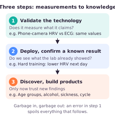
Three steps. First validate the sensor (phone-camera readings matched a clinical ECG heart recording). Then use it at scale and confirm a known lab result: heart-rate variability (HRV, how much the time between heartbeats varies) drops after hard training. Only then trust new findings.
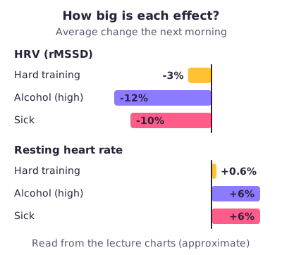
Context. HRV falls about 3% after hard training but 10 to 12% after sickness or heavy drinking. It reacts to every stressor but names none, so user tags or data from other apps must say what happened.
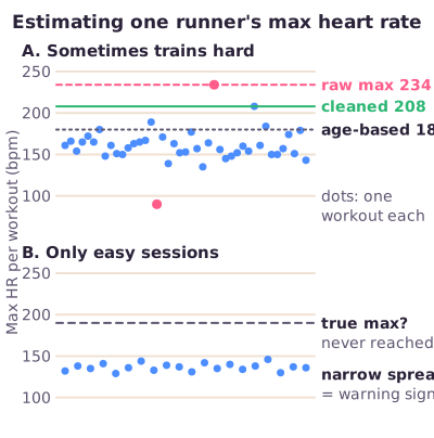
Quality control. Wearables rarely flag a bad reading, and estimating maximum heart rate from workouts assumes some hard sessions. Cleaning removes a glitch such as 234 beats per minute, but cannot reveal the maximum of someone who never trains hard.
Selection bias. Dropping users with gaps keeps only consistent loggers, and app users are already a self-selected, health-interested group. A bigger sample does not change who is in it.
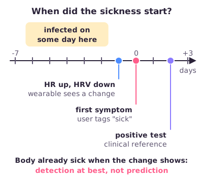
Reference data. A model needs a trusted answer to learn from, such as a race time or the day someone got sick. It comes from user tags or from APIs, connections through which one program automatically fetches data from another. Without it, unlimited data are useless. Sickness onset is itself uncertain, and wearables detect illness rather than predict it.
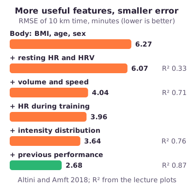
Running case. Altini and Amft (2018) predicted about 2,100 runners' best 10 km times from the preceding three months of training, with multiple linear regression. The share of differences explained (R²) rose from 0.33 to 0.87, the typical error was about 2.6 minutes (2 in the lecture's summary), and previous performance predicted best.
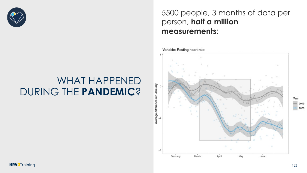
Scale cuts both ways. In the 2020 lockdown, resting heart rate fell (less travel, more sleep), but the users are self-selected and averages hide individuals. A 5% false-alarm rate means 50,000 false alarms per million users.
What to be able to do
List the limits of a lab study; order the three steps with their HRV examples.
Tell an artifact from a missing hard effort; compute % of max heart rate.
Explain how deleting incomplete users causes selection bias.
Define reference data, an API (with a sport example) and the sickness day-0 problem.
Tell the running study in four lines and read its RMSE and R².
Give two limits of the pandemic finding; compute false alarms at scale.
Got the big picture?Mark the overview done to fill this lecture's ring.
2Step 2 of 312–18 min
Detailed notes
Lecture 9 is a guest lecture by Marco Altini, founder of the HRV4Training app and data science advisor to Oura, on what changes when sport and health data come from the users of an app or wearable instead of from a lab.
User-generated data are content created by the users of a product; here, sport and health data from wearables and phones. They create value for research, products and insights through a larger sample size, realistic settings, and unforeseen outcomes (findings nobody planned to look for).
The lecture's three products:
HRV4Training (2012–). A phone app: each morning a fingertip on the camera measures resting heart rate and heart-rate variability (HRV, how much the time between heartbeats varies). Users tag days as "Sick", "Travel", "Menstruation". New use: identifying and managing stressors.
Bloomlife (2015–). A pregnancy wearable recording uterine and cardiac activity. New question: can we detect or predict the onset of labour?
Oura ring (2013–). Built for sleep tracking, but it also records heart rate, HRV and temperature. New question: can we detect or predict an infection?
What they share: none of these uses was the original goal of the product. User-generated data made them possible through two ingredients:
Contextual data: context, confounders (third factors that affect both the thing you study and the outcome) and other variables, monitored longitudinally (repeatedly, in the same people, over time).
Reference points: key events, obtained through APIs (section 8) or reported by the user, such as a clinical diagnosis.
Context explains a change: "drank alcohol last night". A reference point is the outcome or key event you predict or line the data up against: a race time, the day someone got sick, a delivery date.
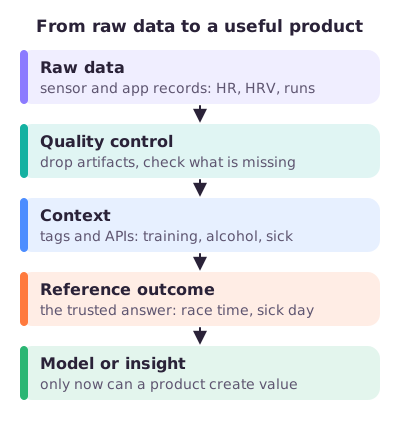
Figure: The path from raw wearable data to a useful product. Skip any gate and the product fails.
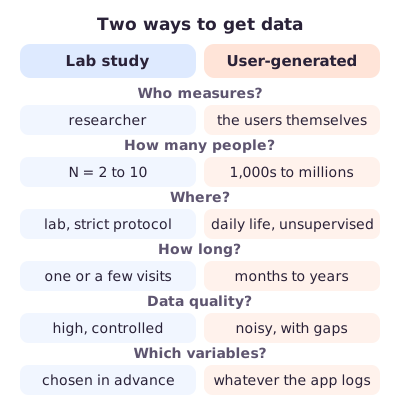
2. Lab study vs user-generated data
A typical study has five steps: (1) design the study, choosing the dependent variable (what you want to explain) and the independent variables (what might explain it); (2) recruit participants, usually a small N; (3) collect high-quality data; (4) analyse them; (5) use the outcome: write a paper, or, in a company, deploy a feature.
The lecture's example: HRV in response to exercise intensity, with training intensity, age and sex as independent variables, in N = 10 male students. Does the result hold for women, other menstrual-cycle phases, other ages, people with health conditions, other sports? Not much.
Typical limitations of lab studies:
Small samples. Many sport science studies have N = 2 to 10.
Low generalizability. Results are valid only for the specific sample analysed.
Costly to extend. Studying another group means running another study, with new costs and time.
Lab is not daily life. The data are high quality, but people measured under a strict protocol (fasted, no coffee, told when to relax) may not represent what happens in real life.
The new paradigm. Phones and their sensors now collect data anywhere, at large scale, in realistic settings where unforeseen outcomes can appear, and data-science infrastructure makes analysing it cheap. Instead of recruiting ten students, you put a tool on the market and thousands of people collect data for years.
The price. A lab study chooses its variables and controls quality before anyone is measured. A product collects data before any research question exists, so you inherit whatever it recorded: noise, gaps, an odd sample, missing outcomes. That is why judging data quality becomes the hard step, the one that differs most from a lab study. Setting up the software for processing and modelling stays easy.
Figure: User data win on scale and realism and lose on control and quality.
3. Three key steps: the HRV case
Heart rate (HR) is beats per minute (bpm). HRV is measured here as rMSSD, a number in milliseconds that grows when neighbouring beat intervals differ more. Stress (hard training, illness, alcohol) usually raises resting HR and lowers HRV. People differ a lot, so the app learns each user's normal range from daily morning measurements and reads today's value against it.
The lecture's three key steps, in order:
Validate the technology, or know its limits. Garbage in, garbage out. The phone-camera measurement (PPG: reading the pulse from changes in light through the fingertip) gave HRV values equivalent to a chest ECG (electrocardiogram, the clinical reference). Alternative: use a tool someone else has validated.
Deploy, and confirm lab-based insights if possible. About 30,000 users, up to 5 years each, 9 million measurements. The known lab finding, that HRV drops after higher-intensity exercise, appeared here too: the morning after hard training, HRV was about 3% below normal and resting HR about 0.6% above (after easy training, HRV was slightly above normal). Data preparation becomes the most important step.
Discover new relations, build new products. The pattern held in every age group from 20 to 60. Four intensity categories (rest, low, average, high) gave a staircase: the harder the day, the lower the next morning's HRV. The data also showed the effects of sickness, alcohol and the menstrual cycle, outcomes you cannot ethically test in a lab.
Why this order. Nobody supervises measurements in the wild. Step 1 shows the sensor works. If step 2 reproduces a known result, the whole pipeline (sensor, users measuring at home, cleaning, analysis) works, so new findings in step 3 are more likely to be real.
Figure: Each step earns the trust needed for the next.
4. HRV needs context
Compared with hard training (HRV about 3% down, resting HR 0.6% up), sickness lowered HRV about 10% and high alcohol intake about 12%, both raising resting HR about 6%.
From the lecture: Sickness and alcohol shifted HR and HRV two to three times as much as training. A training app that ignores lifestyle stressors mostly picks those up, and gives wrong training advice.
HRV is a sensitive but not specific marker of stress: it reacts strongly to every stressor, but a drop does not say which one. Training, a cold, a party and a long flight can look the same. Only context separates them, either manually from the user (tags such as "Sick") or automatically through APIs (a workout app, a weather service).
Group vs individual. These percentages are averages over thousands of users. A given person may react more, less, or in the opposite direction.
Figure: Lifestyle stressors move morning physiology far more than training does.
5. Quality control: the max-HR problem
The challenges of user data fall into three groups: data preparation (quality control, noisy data, missing data), reference data (which outcomes are available?) and data engineering (building the systems that collect and store data; not covered).
Wearable data are extremely noisy and often inaccurate, and typically no signal-quality metric is reported: the watch shows a heart rate even when the signal is bad, so you must decide when to trust it.
The lecture's example: training intensity. How hard a session was for a person is its heart rate relative to their maximum:
Without lab tests, max HR must be estimated from the workouts. That assumes the monitored period contains some hard sessions, so it must be long enough. Across 500 users, some per-workout maxima were above 300 bpm (impossible) or below 100 bpm. A simple method flags values more than 3 standard deviations (SD, the typical distance of values from their mean) from the mean as outliers.
For one user, the highest recorded value was 234 bpm: an artifact, a reading caused by a measurement problem rather than by the body. After removing outliers the estimate was 208 bpm. An age-based formula gave 180 bpm, which cannot be trusted because max HR differs hugely between people.
Worked example: A session at 170 bpm for this user.
Raw max 234: 170 / 234 = 73% of max, a moderate session.
Cleaned max 208: 170 / 208 = 82%, the best estimate.
Age-based max 180: 170 / 180 = 94%, close to all-out.
But did they ever go hard? This is a separate problem. If someone always trains easy, their true maximum is simply not in the data. Removing the 234 bpm glitch fixes the artifact; it does nothing for the never-hard user, whose clean maximum is still too low, so every session looks harder than it was. A high percentile (the value below which, say, 95% of readings fall) resists one wild reading better than the maximum does (see Lecture 7), but it cannot create a maximal effort either.
From the lecture: Never-hard users show up as a very narrow spread of session heart rates. How much they matter depends on how common they are: 3 out of 7 users is a big problem, 3 out of a million barely matters.
Only a fraction of the data will be usable, so you need automatic methods that decide what to trust. Keep unreliable data and estimates suffer; throw too much away and the sample shrinks.
Figure: Panel A uses the lecture's values (234, 208, 180). Panel B illustrates a runner who never trains hard.
6. Missing data and selection bias
Missing data are values that should exist but were not recorded: workouts not synced, or no hard effort at all. With so much data, it is tempting to drop every user with gaps. You sometimes can, but it could introduce a bias, because you no longer have the full picture.
People with gaps are not random. Keep only complete logs and you keep the disciplined, consistent, probably fitter users. That is selection bias: the people left differ systematically from the people you want to describe. App data add self-selection: users chose the app, so they are health-interested and, in the running study, mostly men. A bigger N does not fix this. More data shrink random error, not a systematic difference in who is included.
And you can always do one more stratification (split into subgroups): one age group, then one sport, then one type of person, and thousands of users shrink to a handful. There is no universal answer: think critically about what is missing and why.
7. Reference data
Reference data are the outcomes or key events you need to learn anything: a race time, the day someone got sick, a delivery date. For a supervised model (one that learns from examples with known answers), the reference outcome is the label, or ground truth, it learns to predict.
Lack of reference data is one of the biggest challenges with user data: users don't come to the lab for tests or report the outcomes models need. What helps: tags, annotations and APIs. The food-diary app MyFitnessPal shows the risk: millions of users logged food, but with no health or performance outcomes there was nothing to learn.
Before collecting data, ask:
What are the outcomes?
Can we track them?
Are we asking too much of the user? This is not a clinical study, so the burden must stay low.
What can we do about it? For example, fetch data automatically through APIs.
Is it ethical to collect them?
Sickness: when did it start? To detect an infection (the Oura question) you need the day the sickness began. The infection day is usually unknown, and symptoms and tests each give a different day, so day 0 is a choice: the day physiology changes, the first symptom, a cluster of symptoms, or a positive test. The choice changes the results.
From the lecture: Wearables detect sickness at best; they do not predict it. If the data show a change, the body is already sick. A ring that "predicts" infection because heart rate rose before reported symptoms is only ahead of a late reference point.
Figure: Each event is a different possible day 0. A positive test date is not the infection date.
8. APIs
Definition. An API (application programming interface) is the access point through which one program automatically requests data from another, usually by sending requests to a server. No person types anything and no user interface is involved.
Sport example. HRV4Training users can link their Strava or TrainingPeaks account (apps where athletes log workouts). Through the Strava API, HRV4Training then fetches each run's date, distance, time, GPS and heart rate; the running study in section 9 got its workouts this way. Likewise, Sport Data Valley pulls new data from Garmin or Polar watches, and a weather API can add temperature or altitude as context without asking the user anything.
What an API cannot fix. It only moves data that already exist. It does not make a sensor accurate, fill in missing workouts, make users representative, or check that an outcome label is correct.
9. Case: 10 km running performance (Altini & Amft, 2018)
Question and data. Can a runner's 10 km time be estimated from data recorded in daily life, without lab tests? About 2,100 HRV4Training users (2016–2017) who linked Strava or TrainingPeaks; each runner's fastest 10 km over two years was the reference outcome.
Method. Features (predictors computed from the data) from the 3 months before that best 10 km, added in six sets; multiple linear regression, tested with 10-fold cross-validation.
Finding. Explained variance rose from R² = 0.33 to 0.87, with a typical error of about 2.6 minutes; previous performance was the strongest predictor, and about 15 workouts were enough.
Limitation. Associations in observational data, not causes; a self-selected, mostly male sample; and the reference is the best logged workout, not a standardized race.
The answer is a number (minutes), so this is regression (Lecture 5). Multiple linear regression predicts the time as a weighted sum of several features, and was chosen because its coefficients are easy to interpret. In 10-fold cross-validation the data are split into 10 parts and each part is predicted by a model trained on the other nine, so no runner is predicted by a model that saw them.
Feature sets, added one at a time:
Anthropometrics (body measures): BMI, age, sex.
Resting physiology: morning HR and HRV.
Training volume and average speed.
Heart rate during training, relative to running speed.
Training-intensity distribution: how polarized the training is (mostly easy plus some clearly hard sessions, little in between).
Previous performance: the best 10 km in the 3 months before the target one.
Fast vs slow runners. Slower quarters of the sample had a higher BMI, fewer kilometres per workout, a higher heart rate for the same speed (lower fitness), and less polarized training. This is association only: fitter runners may simply choose to train more, and more polarized.
Figure: Error falls as features are added. Volume and speed give the biggest jump; previous performance gives the best model.
Reading the results.
RMSE (root mean squared error; computed in Lecture 5) is the typical size of a prediction error, in minutes here. It fell from about 6.3 minutes (anthropometrics only) to about 2.6.
R² is the share of the differences in 10 km time between runners that the model explains: 0.33 with resting physiology, 0.71 with volume and speed, 0.76 with intensity distribution, 0.87 with previous performance. R² is not accuracy: 0.87 does not mean 87% of predictions are correct.
4% is the mean percentage error: on average a prediction missed by about 4% of the real time.
How much data? The error dropped until about 15 workouts and no further after that, which tells a product when to show a first estimate.
10. Case: resting heart rate in the pandemic
During the first COVID-19 lockdown (March to May 2020), about two thirds of people in a poll expected resting heart rate to rise, because of stress.
Data from about 5,500 users, 3 months each, half a million measurements, showed the opposite: resting HR fell, to roughly 1.4 bpm below its January level by April and May, against a dip of about 0.4 bpm in 2019. The same app data suggest why: travel dropped sharply and sleep time rose. People stopped travelling and commuting, so they slept more. These are plausible explanations, not proven causes.
No lab could plan this; the app was already measuring thousands of people daily, 2019 included. But limitations still apply:
Who are we talking about? The users are self-selected, health-interested people, so the result may not generalize.
Group averages. Some individuals' resting HR went up; the average hides them.
Figure: Resting heart rate relative to January, 2019 in grey and 2020 in blue, first wave boxed. Negative means lower than in January.
11. Scale and data products
A false-positive rate (the share of healthy people who get a wrong alarm) is a property of the method and does not change with the number of users; the number of false alarms does.
Worked example: An illness alert with a 5% false-positive rate. Study of 20 healthy people: 0.05 × 20 = 1 false alarm. App with 1,000,000 healthy users: 0.05 × 1,000,000 = 50,000 false alarms, enough to swamp family doctors.
The lecture's conclusions:
Not everything is, or can be, a data product. Data are often collected but never used meaningfully, creating no value for the company or the user.
Reference points are key: you can have unlimited data and still have no use for it.
More research uses consumer products: a different opportunity, not better or worse than academic research.
Think critically about reference points, data preparation and estimated vs measured values: the age-based max HR (180 bpm) is an estimate; the cleaned max from the user's workouts (208 bpm) is measured.
Exam traps
Hardest workflow step with user data: judging data quality. Easiest: setting up the software.
Order: validate → confirm a known lab result → discover. Wrong options swap steps 2 and 3.
HRV is sensitive, not specific: a drop says "stress", not which stressor.
Cleaning fixes the artifact (234 bpm), not the missing hard effort.
Context explains a change; reference data are the outcome or key event.
A bigger N does not fix selection or self-selection bias.
Wearables detect sickness; they don't predict it. Infection, symptom and test days differ.
Running study: the lecture's summary says "N = 2100, RMSE = 2 minutes (4%)"; the paper reports 2,113 runners and 2.6 minutes. 4% is the mean percentage error, not accuracy.
R² = 0.87 is variance explained, not 87% correct; a time outcome means regression, not classification.
About 15 workouts (training sessions), not 15 days.
The false-positive rate stays fixed; the count grows with users.
Try the interactive explanation
Open the interactive page: add a 315 bpm artifact to a runner who only trains easy and see that filtering fixes the glitch but cannot create a maximal effort.
Worked through the deep dive?Tick it off. Come back to any section whenever you need it.
3Step 3 of 35–8 min
Practice questions
3 exam-style questions. Exam-style open questions: short, with the points shown like on the real exam. Write your answer in the box, then check it against the model answer and the marking guide.
Question 1 — Artifact vs missing hard effort (3 points)
A fitness app uses each user's single highest recorded heart rate as their maximum heart rate. One user did only easy sessions, plus one isolated reading of 315 bpm. State and motivate briefly: 1) Name the two different problems with this user's estimated maximum. 2) Does removing the 315 bpm reading solve both problems? Explain.
Show answer and rationale
1) Artifact: 315 bpm is impossible for a human, so it is a sensor glitch that makes the maximum far too high. Missing hard effort: the user only trained easy, so the true maximum was never reached and is not in the data.
2) No. Removing the glitch (e.g. with the ±3 SD rule) fixes the artifact, but then the highest clean value comes from an easy session, so the maximum is still underestimated. Cleaning cannot create a maximal effort that never happened.
How the points are earned
1 pt Problem 1: the 315 bpm reading is an artifact (impossible value) that inflates the maximum
1 pt Problem 2: only easy sessions, so the true maximum was never reached (missing hard effort)
1 pt Removing the reading fixes only the artifact; the clean maximum is still too low, cleaning cannot create the missing effort
How did your answer compare?
Question 2 — Three key steps (2 points)
A company that sells a sleep ring wants to use its existing heart recordings to build an illness alert. State and motivate briefly: 1) Name the lecture's three key steps, in order. 2) Why should the second step come before the third?
Show answer and rationale
1) Validate the technology (show the ring measures what it claims, e.g. against an ECG); use it at scale and confirm a result already known from lab studies; then discover new relations and build new products.
2) If the app data reproduce a known lab result (e.g. HRV drops after hard training), the whole pipeline (sensor, users measuring at home, cleaning, analysis) works, so new findings such as an illness signal are more likely to be real. Garbage in, garbage out.
How the points are earned
1 pt Three steps in the right order: validate → deploy and confirm a known lab result → discover new relations / build products
1 pt Reproducing a known result shows the data pipeline works, so new findings can be trusted
How did your answer compare?
Question 3 — Reference outcome and API (3 points)
For the same illness alert, the company needs a reference outcome. State and motivate briefly: 1) What is a reference outcome? Give one for this alert. 2) Why is the start day of an illness an uncertain reference? 3) How could an API help, and what can it not guarantee?
Show answer and rationale
1) The trusted 'answer' a model learns to predict or the key event you line the data up against (also called ground truth or label). Example: the day of the first symptom reported in the app, or the date of a positive test.
2) The infection day is usually unknown (it could be any of several earlier days), and symptom day, test day and the day heart rate changes all give different days; the analyst must choose a day 0.
3) An API can fetch outcome or context data automatically from another service (e.g. a test result or workouts), with no burden on the user. It does not guarantee that the label is correct or well timed, that users are representative, or that the data are accurate.
How the points are earned
1 pt Defines reference outcome as the trusted answer/key event a model learns from, with an illness example (symptom day, positive test)
1 pt Infection day unknown; symptom, test and physiology give different start days
0.5 pt API fetches data automatically from another program, without burden on the user
0.5 pt API does not guarantee correct labels, representativeness or accuracy