First read: about 5 minutes. Lecture 3: Data in sport and health.
Every data project starts with a question. The next step is getting data that can answer it. Data scientists call this step data acquisition. This lecture covers that step for sport and health: what kinds of data exist, what they can reveal, how to get data you did not collect yourself, and how to store data so that you, and other people, can still use them years later.
Two cases run through the lecture. In the first, researchers measured 28 top cyclists, from whole-body tests down to single muscle fibres. They wanted to know what lets a rider be good at both sprinting and endurance (van der Zwaard et al., 2018). In the second, a team used a small program to pull years of speed-skating results from a results website. They then drew each skater's progress as a "spider web" (radar) chart. Along the way, examples such as Fitbit's resting-heart-rate data from millions of users show what large data sets can reveal.
The lecturer cares less about the numbers than about the reasoning: how to read a correlation, which kind of best-fit line suits the question, and why a sample of people who are all alike can hide a real relationship.
The ideas to keep
Blur the explanations and test yourself.
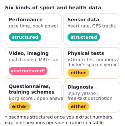
Structured vs unstructured data. Structured data fit straight into a table of rows and columns: peak power in watts, heart rate per second, a Borg score (a rating of how hard exercise feels), injury yes/no. Unstructured data have no ready-made table: match video, an MRI scan, an athlete's open answers in an interview. Video becomes structured once software pulls numbers out of it, such as joint positions per frame. Physical tests, questionnaires and diagnoses can be either, depending on how the answers are recorded.
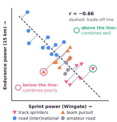
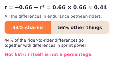
The sprint–endurance trade-off. Among the 28 cyclists, riders with more sprint power had less endurance power. The correlation coefficient r sums this up. It runs from −1 to +1 and shows how tightly two measures move together; a minus sign means one goes up while the other goes down. Here r = −0.66. To get the share of differences the two measures have in common, square r: 0.66 × 0.66 ≈ 0.44, so about 44%. r itself is not a percentage, so "66%" is wrong.
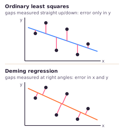
Perpendicular distances: Deming regression. A regression line is the best straight line through a cloud of points. The usual method, ordinary least squares, places the line so that the vertical gaps between the points and the line are as small as possible. That assumes the x-axis measure has no measurement error. Deming regression allows error in both measures and uses the perpendicular distance instead: the shortest, right-angle gap. In the cycling study, each rider's perpendicular distance from the trade-off line showed how well they combine sprint and endurance compared with the group.
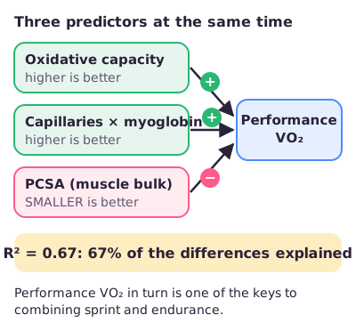
Multiple regression and the 67%. Multiple regression predicts one outcome from several measures at once. It reports R²: the share of the differences between people that the model explains. Three things together explained 67% of the differences in performance VO₂ (how much oxygen the rider uses during a 15 km time trial), which is a key driver of combined performance. They were high oxidative capacity (how much oxygen the muscle fibres can burn), more capillaries × myoglobin (tiny blood vessels times the muscle's own oxygen-storing protein) and a small PCSA (less muscle bulk in cross-section). Learn the method; the lecturer does not expect you to know the numbers.
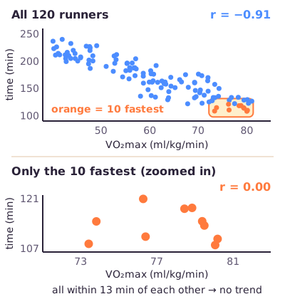
Restricted range. If a measure barely differs between the people in your sample, no relationship with it can show up, even if one exists in a wider group. Example: elite cyclists probably all have similar pennation angles (the angle at which muscle fibres pull), so in the study the angle seemed to make no difference. Always check how much each variable varies before you model it.
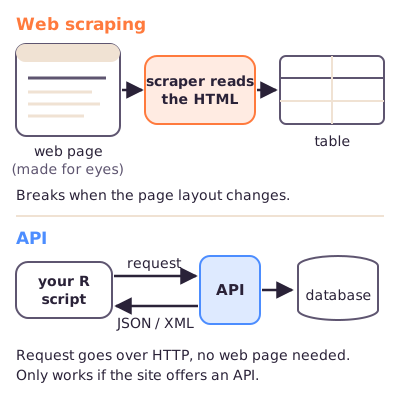
Web scraping vs API. Web scraping means a program reads web pages (their HTML code, the text behind every page) and copies the information into a table. An API (application programming interface) is a door that a website deliberately offers to programs. Your program sends a request over the internet and gets structured data back, usually as JSON or XML (two common text formats for labelled data). The skating project used the API of a results website.
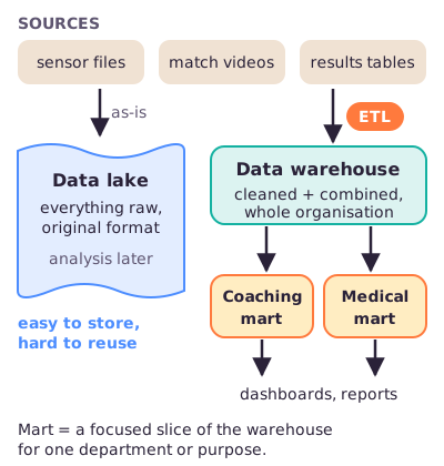
Warehouse, mart, lake. A data warehouse is one central store that combines cleaned data from many sources across an organisation, for reports and decisions. A data mart is a smaller, focused slice of the warehouse for one department or purpose. A data lake stores everything raw, in its original format, to be analysed later. It is easy to fill but hard to reuse.
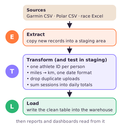
ETL. Extract–Transform–Load is how data get into a warehouse. Extract: copy data out of the sources into a temporary holding area (the staging area). Transform: clean the data, fix formats and units, remove duplicates and summarise. Load: write the result into the warehouse.
What to be able to do
Sort data into structured or unstructured (walking videos: unstructured; a diagnosis coded as one of four types: structured).
Turn a correlation into shared variance: r = −0.66 → r² ≈ 0.44 → about 44%.
Say in one sentence each what ordinary least squares and Deming regression make as small as possible, and what a rider's perpendicular distance means.
Name the analysis in van der Zwaard et al. (2018): Deming regression for the trade-off, then correlations and multiple regression judged by variance explained (R²). Name the three predictors of performance VO₂ and their directions.
Spot restricted range in a scenario and explain why "no significant relationship" does not prove "no relationship".
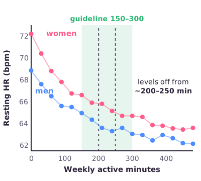
Sketch the Fitbit result: resting heart rate falls steeply with weekly active minutes, then levels off from about 200–250 minutes per week; women sit higher than men throughout.
Define an API, give a sport example, and say how it differs from web scraping.
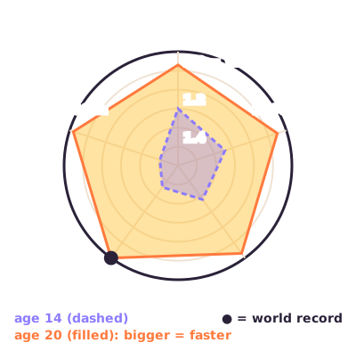
Read the skating radar chart: the outer rim is 1.0 (the world record), the centre is slow, so a bigger shape means faster times.
Pick a warehouse, mart or lake for a scenario, and give an example action for each ETL step.
Next step
Read the deep dive where you need more explanation, then try the practice questions before opening the answers. The full slides are here for offline use.
Got the big picture?Mark the overview done to fill this lecture's ring.
2Step 2 of 312–18 min
Detailed notes
This deep dive teaches Lecture 3 from zero, so you do not need the slides next to you. It covers the kinds of sport and health data, what they can reveal, the cycling study by van der Zwaard et al. (2018) and the statistics behind it, how to get data from websites, and how to store and prepare data for analysis. Examples marked Illustration are invented to explain a point; everything else comes from the slides, the paper or the lecture recording. Sources checked 11 October 2026: slides, Canvas recording transcript, van der Zwaard et al. (2018).
The course follows a data science lifecycle: a fixed series of steps that every data project goes through. They are: identify the problem, data acquisition (getting the data), data preparation (cleaning and organising it), data exploration (looking at it), feature engineering (building useful variables), data modelling, visualisation, presenting and communicating, and finally deployment and maintenance (putting the result to use and keeping it working). This lecture is about the second step, getting data, and the start of the third, preparing it.
The story has three parts. First, what sport and health data look like and what they can reveal: six categories of data, a radiology example, a health-insurance scheme, millions of Fitbit users, and a detailed cycling study that combines many kinds of measurement to explain why being good at both sprinting and endurance is hard. The cycling study also teaches three pieces of statistics the lecturer cares about: how to read a correlation, why the study drew its best-fit line in an unusual way, and why a sample of very similar athletes can hide a real relationship.
Second, how to get and keep data you did not collect yourself: spreadsheet files and databases, copying information from web pages (web scraping), and asking a website's data service directly (an API). A speed-skating project shows the whole route from website to chart.
Third, how organisations keep data ready for analysis: the data warehouse (one central, cleaned store), the data mart (a focused slice of it) and the data lake (everything kept raw), and ETL, the extract–transform–load routine that fills a warehouse.
Key terms
Every technical word on this page, in the order you meet it.
Data science lifecycle — the fixed series of steps of a data project, from defining the problem to keeping the result running. Getting data is step 2.
Data acquisition — obtaining data that can answer your question, by measuring it yourself or by taking data that already exist. Downloading race results from a website is acquisition.
Data preparation — making raw data usable: cleaning, fixing formats, combining tables. Converting all times to seconds is preparation.
Variable — one thing you measure, stored as one column. Peak power is a variable.
Structured data — data that fit straight into rows and columns. A table of heart rate per second.
Unstructured data — data without a ready-made table, such as video, images or free text. A match video.
Dimensionality (complexity) reduction — summarising many variables into a few that still carry the main message. Turning 22 players' GPS tracks into "team surface area".
Borg scale — a rating of how hard exercise feels. "I'm at 15: hard".
Resting heart rate — heartbeats per minute while fully at rest. 62 bpm.
BMI (body mass index) — weight in kg divided by height in metres squared. 70 kg and 1.75 m gives 22.9.
Error bar — the line drawn above and below an average to show how uncertain that average is. A long bar means "don't trust this dot much".
Standard deviation (SD) — the typical distance of individual values from their mean: how spread out people are. Resting HR SD of 8 bpm.
Standard error (SE) — how uncertain a sample mean is; SD divided by the square root of the number of people. Shrinks as the sample grows.
n — the number of people (or observations) in a sample. n = 28 cyclists.
Wingate test — a 30-second all-out sprint on a bike ergometer (a stationary test bike). Gives peak power in watts.
Time trial — riding a set distance as fast as possible, here 15 km. Gives mean power.
VO₂max — the highest rate at which the body can take up and use oxygen. 70 ml per kg per minute.
Performance VO₂ — the oxygen uptake during the time trial itself.
Oxidative capacity — how much oxygen a muscle fibre can burn to make energy. Endurance athletes have high values.
Muscle fibre — one muscle cell; a muscle is bundles of thousands of them.
Fibre type — fast fibres (powerful, tire quickly) versus slow fibres (less power, very fatigue-resistant).
FCSA (fibre cross-sectional area) — the area of one fibre cut across. A big FCSA means thick fibres.
PCSA (physiological cross-sectional area) — the area of all fibres of a muscle cut at right angles to the fibres; roughly the muscle's "bulk" that pulls side by side, linked to maximal force.
Fascicle length — the length of a fibre bundle inside the muscle.
Pennation angle — the angle between the fibres and the line along which the muscle pulls.
Capillaries — the tiniest blood vessels, which bring oxygen to each fibre.
Myoglobin — a protein inside muscle that stores oxygen and moves it into the cell.
Gross efficiency — the share of the energy a rider burns that ends up as power on the pedals. About 20% in cyclists.
Lean body mass — body mass minus fat mass.
Correlation coefficient (r) — a number from −1 to +1 for how tightly two variables move together in a straight-line way. r = −0.66: one tends to go down when the other goes up.
p-value — the chance of seeing a relationship at least this strong if there were truly none. p < 0.001 means very unlikely to be luck.
Shared variance (r²) — r squared: the share of the differences in one variable that go together with differences in the other. r = −0.66 gives 0.44, so 44%.
Regression line — the best straight line through a cloud of points, used to describe or predict one variable from another.
Intercept (β₀) — where the line crosses the y-axis, the predicted y when x is 0.
Slope (β₁) — how much the line goes up (or down) for one step to the right.
Residual — the gap between a data point and the line.
Ordinary least squares (OLS) — the standard way to fit a line: make the sum of the squared vertical gaps as small as possible. Treats the x variable as error-free.
Deming regression — a way to fit a line when both variables have measurement error; with equal errors it makes the perpendicular gaps as small as possible.
Perpendicular residual — the right-angle (shortest) distance from a point to the line. In the cycling study: a rider's combined sprint-plus-endurance score.
Multiple regression — a regression with several predictors at once. Predicting oxygen use from three muscle measures.
Predictor and outcome — the predictor is what you use to explain or predict; the outcome (target) is what you want to explain. Muscle volume (predictor) → sprint power (outcome).
R² (coefficient of determination) — the share of the outcome's differences between people that the model explains. R² = 0.67 means 67%.
Stepwise regression — adding predictors one at a time, keeping each only if it clearly raises R².
Interaction term — a predictor made by multiplying two measures, so it is high only when both are high. Capillaries × myoglobin.
Cross-sectional study — measuring everyone once, at one moment, with no intervention. Shows associations, not cause and effect.
Restricted range — when a variable barely varies in your sample, so its relationship with anything else cannot show up.
Spreadsheet file (.xls / .xlsx) — Excel's file formats; each has a maximum number of rows and columns.
CSV (comma-separated values) — a plain text file with one row per line and values separated by commas. Opens anywhere, has no built-in size limit.
Flat file — a single stand-alone data file, such as a CSV, with no links to other tables.
Database — organised storage of data in tables of rows and columns, indexed so records can be found quickly.
Index — a lookup list, like the index at the back of a book, that lets a database jump to the right rows.
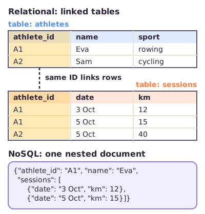
Relational database — a database of several tables linked by shared IDs. An athletes table and a sessions table linked by athlete ID.
Key (ID) — the column that identifies a record and links tables. athlete_id = A1.
RDBMS — relational database management system: the software that runs a relational database, such as MySQL or Microsoft Access.
SQL — Structured Query Language, the language used to ask a relational database for data.
NoSQL — databases that do not use linked tables, for example storing each record as one nested document. MongoDB is one.
HTML — the text code behind every web page that tells the browser what to show.
Web scraping — a program reads web pages and copies the information out of them into structured data.
API (application programming interface) — the code that controls the access point through which a program can request data from (or send data to) a service's server.
Server — the computer that hosts a website and its database.
Frontend — the part of a website or app that people see and click.
HTTP request — the standard message a browser or program sends over the internet to ask a server for something.
JSON — JavaScript Object Notation: a compact text format of "key": value pairs, e.g. {"distance": 500}.
XML — Extensible Markup Language: a text format that wraps values in tags, e.g. <distance>500</distance>.
Semi-structured data — data with labels but no fixed table shape, such as nested JSON.
Seasonal best (SB) — an athlete's fastest time over a distance in one season.
World record (WR) on race day — the record that was valid on the date of that race.
Radar (spider-web) chart — a chart with one spoke per category and a shape joining the values.
Data warehouse — one central store combining cleaned data from many sources across an organisation, for reports and decisions.
Metadata — data about data: units, device, who measured and when.
Summary data — pre-computed totals or averages, such as kilometres per week.
Normalised vs denormalised design — normalised: each fact stored once, split over linked tables; denormalised: some facts repeated in wide tables so questions are answered faster.
3NF (third normal form) — a strict normalised design rule.
Transactional (OLTP) system — an everyday system that records events as they happen (online transaction processing), like a race-timing system.
Data mart — a smaller, focused slice of a warehouse for one department or purpose.
Data lake — cheap, very large storage that keeps everything raw, in its original format, for analysis later.
Schema — the agreed structure of a table: which columns, which data types.
Schema-on-write — the structure is fixed before storing; data must fit when written (warehouse).
Schema-on-read — data are stored as they are; structure is applied when you read them (lake).
ETL (extract–transform–load) — the routine that copies data out of sources, makes them consistent, and writes them into a warehouse.
Staging area — a temporary holding area where extracted data are checked and transformed before loading.
Full vs partial extraction — copying everything each time, versus only the records that changed.
Deduplication — removing records that appear twice.
Aggregation — combining many records into a group total, such as countries into continents.
Business intelligence (BI) tools — dashboard and reporting software that reads from a warehouse.
1. Data acquisition starts with the question
Plain definition. Data acquisition means getting data that can answer your question. You can measure it yourself in the lab, but a data scientist increasingly uses data that already exist: wearables, websites, club databases, public registers.
The lecture gives four questions to answer, in this order, before you collect anything:
What data do I need to answer my question?
Where can I find these data?
How can I obtain them (open download, permission, an API)?
What is the most efficient way to store and access them?
Why it matters. Large data sets fill hard drives quickly, so you must decide what is worth keeping. And collecting data costs your participants time and effort.
From the lecture: almost every new master student wants to "collect everything". The lecturer called this inefficient and also an ethical problem: do not burden participants with tests or sensors you will not use [66:46].
Illustration: you want to know whether jump load predicts knee pain in volleyball players. You need jumps per player per training (from the team's wearable platform, maybe through its API) and pain reports (a short weekly questionnaire). You probably do not need full video of every training, which would take terabytes and add nothing to this question.
Exam angle: questions often ask which lifecycle step an action belongs to. Getting data from a website or wearable is acquisition; cleaning and merging it is preparation.
In short: decide what you need, where it is, how to get it and how to store it, before you collect, and collect no more than you need.
2. Six kinds of data, structured or not
Plain definition. The lecture sorts sport and health data into six categories: performance, physical tests, video and imaging, questionnaires and training schemes, sensor data, and diagnosis. Across these categories, the key distinction from the previous lecture is structured versus unstructured data.
Structured data fit straight into a table: each row is a person or moment, each column a variable, each cell a number or category.
Unstructured data have no ready-made table: video, images, sound, free text. You must first extract numbers before most analyses can use them.
Analogy: structured data are a filled-in spreadsheet; unstructured data are a shoebox of photos and letters.
Figure: the six data categories with the usual type. Video is unstructured until you extract numbers from it.
From the lecture: the lecturer sorted each category in class [05:04]:
Category
Structured example
Unstructured example
Performance
race time, max power output
(rarely)
Sensor data
columns of heart-rate or GPS numbers
(rarely)
Video, imaging
joint positions extracted by markerless motion capture
the raw video or scan
Physical tests
VO₂max test numbers
a doctor saying "your exercise tolerance is good"
Questionnaires
Borg score, closed tick-box answers
open interview answers
Diagnosis
injury yes/no
a free description of well-being
Markerless motion capture is software that finds body landmarks (knee, hip, ankle) in ordinary video. Once it has written those positions into a table, you are no longer working with video but with structured numbers.
Dimensionality reduction. Sensor data quickly become huge. In the lecture's football example, every player wears a Catapult vest: a harness with a sensor recording GPS position, heart rate, acceleration and sometimes rotation. With 22 players and many numbers per second, the data have very many dimensions (variables). The analysis software turns all of it into two simple lines per team: the surface area the team covers on the pitch and the team's length (how far it stretches). Coaches can then see at a glance whether the team spreads out or closes down space as planned.
From the lecture: reducing dimensionality (or complexity) is core vocabulary for the course, because movement data almost always have many dimensions. The goal is to let a statistical model, rather than the researcher, choose which variables matter, which is more objective [12:42].
Common confusion: "video is always unstructured". The raw video is, but the coordinates extracted from it are structured.
Exam angle: expect a scenario such as "walking videos of patients plus their diagnosed type (one of four categories)". Answer: the videos are unstructured, the type is structured. Same logic: an ultrasound scan is unstructured, a VO₂max value is structured.
In short: six categories; ask of each data set "does it already fit in a table?"; extracting numbers turns unstructured data into structured data.
3. What data can reveal: radiology, insurance and Fitbit
Radiology and AI
The slide lists three benefits of artificial intelligence (AI) in radiology: faster screening for possible abnormalities and patterns, time saved, and less risk of misdiagnosis. These are potential benefits that still need to be tested; using AI does not guarantee fewer errors.
From the lecture: the AI only compares grey values in the image and does not "know" it is looking at a brain. That makes it more consistent than human readers, whose judgement depends on where they trained and how they feel that day. But context, such as months of headaches, is not in the image. So the machine pre-screens and a clinician interprets [14:44].
An activity-based insurance discount
The Dutch insurer ASR offered a discount for being active: personal goals, gifts and discounts, a mobile app that tracks activity, and extra points for sharing personal information (BMI, cholesterol, blood pressure and blood sugar). This shows the commercial value of activity data. It also raises questions: whose interests does the scheme serve, and what consent and privacy rules apply?
From the lecture: the scheme did not make inactive people active. It mainly rewarded people who were already active, and people who lost the discount experienced that as a punishment. Individual incentives do not solve a system-wide problem [20:06].
Fitbit: 150 billion hours of resting heart rate
Fitbit pooled about 150,000,000,000 hours of resting-heart-rate data from its users. Resting heart rate is a rough measure of overall health. It is linked to regular exercise, age, sex, emotional state, stress, diet, hydration, body size, blood pressure and heart medication. The company looked at four things: men versus women, age, the best BMI, and physical-activity guidelines.
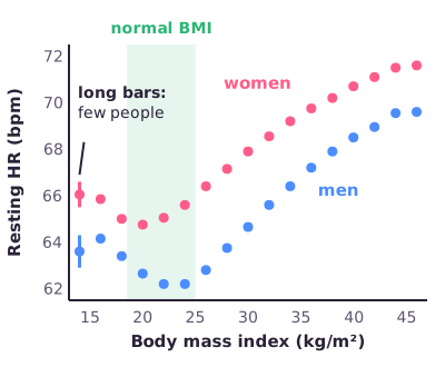
BMI. Resting heart rate against BMI is U-shaped: lowest in the normal BMI range (about 20–24 in this chart), higher at very high BMI and also at very low BMI. Women sit above men at every BMI.
Figure: resting heart rate by BMI (values read off the Fitbit chart, approximate). Note the long error bars at BMI 14.
From the lecture: women's higher resting heart rate has one physical explanation: on average a smaller heart, which must beat more often to move the same blood. Very low BMI may raise heart rate through poor nutrition or having less fat to stay warm [23:29].
Error bars and small groups. The dots at BMI 14 have long error bars. Few people have such a low BMI, so those averages are based on very few people and are uncertain. Read the extremes of such a chart with caution.
Correction: in the recording the lecturer said the standard deviation is larger because n is small [37:48]. Strictly, the SD describes how spread out people are and does not shrink as you add people. The standard error (SE), which error bars often show, does:
In words: the uncertainty of an average is the spread between people divided by the square root of how many people you measured.
Worked example: suppose resting heart rate has an SD of 8 bpm. With n = 4 people, SE = 8 / √4 = 8 / 2 = 4 bpm, a long error bar. With n = 400 people, SE = 8 / √400 = 8 / 20 = 0.4 bpm, a tiny bar. Same spread between people, very different certainty.
Activity: the think–pair–share task (think alone, discuss in pairs, share with the class). The lecture asks you to draw, before seeing the data, the expected relationship between weekly active minutes and resting heart rate for men and women, with expected cut-off numbers.
A good answer: resting heart rate falls steeply at first and then levels off (a curve that flattens, which the class called "hyperbolic"). It cannot keep falling, because the body needs a minimum heart rate to keep blood flowing through the organs. Men and women follow the same shape, with women shifted higher.
Figure: the Fitbit result (values read off the chart, approximate). The drop flattens from about 200–250 minutes per week, inside the 150–300 minute guideline band.
Worked example: reading the chart, women go from about 72.2 bpm at 0 minutes to about 65.8 bpm at 210 minutes, a drop of 6.4 bpm. From 210 to 480 minutes they drop only about 2.2 bpm more (to 63.6). For men: 68.9 → 63.6 bpm (5.3 bpm) over the first 210 minutes, then only about 1.5 bpm more. Most of the benefit comes in the first 200 or so minutes.
From the lecture: a student guessed the plateau starts at 350 minutes; the lecturer placed it earlier, at about 200–250 minutes per week. For lowering resting heart rate alone, more than about 200 minutes adds little. That fits the guideline of 150–300 active minutes per week. The gap between men and women stays roughly constant; points at high minutes come from fewer people [34:33].
Common confusion: these are averages over unknown people. We do not know who wears a Fitbit or why, so the data suggest patterns but cannot explain them.
Exam angle: sketch or recognise the curve (steep drop, plateau from about 200–250 min/week, women higher), and explain wide error bars at the extremes by small n.
In short: AI can pre-screen but needs clinical context; incentives alone did not activate inactive people; the Fitbit data show a U-shape with BMI and a levelling-off drop with activity, and few people at the extremes means uncertain dots.
4. The cycling case: the question and the measurements
This is the lecture's main case: van der Zwaard et al. (2018), Critical determinants of combined sprint and endurance performance. A determinant is a factor that helps explain performance.
The problem. Sprinting needs a lot of force and power, which comes with big muscles made of thick fibres. The slides contrast the track sprinter Förstemann, with massive thighs, and the lean road cyclist Froome. Endurance needs muscles that burn a lot of oxygen: high oxidative capacity. Across animals, thicker fibres have lower oxidative capacity. The curve drops steeply and then flattens: the slide plots oxidative capacity against FCSA (fibre cross-sectional area, 0–20,000 µm²) for animals of many sizes, humans included. Oxygen has further to travel into a thick fibre. So it is hard to have both.
The aim. Find the critical determinants of combined sprint and endurance performance, measured at four levels: the whole body, the blood, the muscle, and the single muscle fibre.
Who. 28 cyclists: 6 track sprinters, 8 team-pursuit riders and 14 road cyclists (4 of them amateurs), competing at national to Olympic level. Average age 26 ± 7 years, height 1.86 ± 0.06 m, weight 77.4 ± 8.1 kg, BMI 22.4 ± 1.9 (the ± values are standard deviations).
Performance tests.
Sprint: a Wingate test, a 30-second all-out sprint on a stationary bike. Outcome: peak power.
Endurance: a 15 km time trial. Outcome: mean power.
Both were divided by lean body mass to the power 2/3, so that bigger riders do not score higher just because they are bigger.
Candidate determinants. The team measured oxygen uptake through a mask, took blood samples, scanned the thigh muscle (vastus lateralis) with 3D ultrasound, measured knee force on a fixed rig, and took a muscle biopsy (a small piece of muscle).
Level
What was measured
In plain words
Whole body
VO₂max, performance VO₂, VO₂ at lactate and ventilatory thresholds, gross efficiency
oxygen use, and how much energy becomes pedal power
muscle volume, fascicle length, pennation angle, PCSA, isometric torque, specific force (force per PCSA)
size, shape and strength of the thigh muscle
Muscle fibre
fibre type, FCSA, number of fibres, oxidative capacity, myoglobin, capillaries
what single fibres look like and how they use oxygen
The thresholds are the exercise intensities at which lactate in the blood, or breathing, starts to rise sharply. MCV, MCH and MCHC describe red-cell size and how much haemoglobin each cell carries.
Analogy for FCSA vs PCSA: picture a rope made of strands. FCSA is the thickness of one strand. PCSA is the thickness of the whole rope when you cut straight across all its strands. They are different measurements.
Why this matters for this course. One question, answered by combining many data categories: performance tests, physical tests, imaging (ultrasound), biopsies and blood. Choosing which variables are meaningful needs domain knowledge: you have to know the physiology.
In short: 28 cyclists, a Wingate sprint and a 15 km time trial, and dozens of possible explanations measured from whole body down to single fibres.
5. The trade-off: reading r = −0.66
The result. When each rider's sprint power is plotted against their endurance power, the points fall from top left to bottom right. Road riders sit top left (good endurance, weaker sprint), track sprinters bottom right, team-pursuit riders in between. The correlation is r = −0.66 with p < 0.001.
Plain definitions. The correlation coefficient r runs from −1 to +1. Values near ±1 mean the points lie close to a straight line; 0 means no straight-line relationship; the sign gives the direction. The p-value is the chance of seeing a relationship this strong if in truth there were none. p < 0.001 means under 1 in 1,000, so this trade-off is very unlikely to be luck.
Figure: Illustration with 28 invented riders that have exactly the study's r = −0.66. Grey lines are each rider's perpendicular (right-angle) distance to the trade-off line; one rider well above the line and one well below are circled.
Squaring r. r is not a percentage. To say how much of the differences the two measures share, square it:
In words: about 44% of the rider-to-rider differences in endurance go together with differences in sprint power; the other 56% go with other things.
Figure: r = −0.66 means about 44% shared variance, not 66%.
Correction: in the recording the lecturer correctly said that you must square r, but then gave "36 to 40%" [46:16]. The right value is 0.66² ≈ 0.44, about 44%. Lecture 4 makes the same point: explained variance is r², not r.
From the lecture: the groups were less separated than many people expect. Some amateur road cyclists were fairly good sprinters, perhaps because they are still developing.
Common confusion: a negative r does not mean "no relationship". r = −0.66 is a fairly strong relationship that runs downhill.
Exam angle: given r, compute r² and say it in words. r = 0.7 means 49% shared, not 70%.
In short: better sprinters tend to be worse endurance riders (r = −0.66); squared, that is about 44% shared variance.
6. Drawing the line: ordinary least squares vs Deming regression
Plain definition of a regression line. A regression line is the best straight line through a cloud of points:
In words: the predicted value of y (ŷ, "y-hat") equals the intercept β₀ (where the line crosses the y-axis) plus the slope β₁ times x. The residual of a point is its gap to the line.
Ordinary least squares (OLS). The usual method picks β₀ and β₁ so that the squared vertical gaps add up to as little as possible:
In words: for every point i, take the vertical gap between the real y and the line, square it, add all squares up, and choose the line that makes this total smallest.
Measuring the gaps straight up and down assumes x is measured perfectly and all error is in y. If you swap the roles of x and y, the gaps become horizontal and you get a different line. Either way, OLS treats one variable as the error-free predictor and the other as the outcome.
Deming regression. In the cycling study neither measure is "the predictor": both sprint power and endurance power are noisy test results. Deming regression allows measurement error in both. When both errors are assumed equally large, it measures the gap at a right angle to the line (the perpendicular, shortest distance) and makes those squared gaps as small as possible.
Figure: the same six points fitted two ways. OLS gaps go straight up or down; Deming gaps meet the line at a right angle, and the line comes out a little steeper.
Analogy: OLS measures how far each house is from a road by walking only due north. Deming measures the shortest walk to the road.
Worked example: take the line y = 10 − x (slope −1) and a rider at x = 4, y = 8. The line predicts y = 10 − 4 = 6, so the vertical gap is 8 − 6 = 2. The perpendicular gap is shorter:
In words: the perpendicular distance is the vertical gap divided by a factor that depends on how steep the line is.
Why perpendicular distances measure combined performance. The Deming line is the group's trade-off: what riders typically achieve. A rider above the line has more endurance than expected for their sprint, and more sprint than expected for their endurance, at the same time. The perpendicular distance captures both in one number. In the paper, the line was endurance = −0.39 × sprint + 51 (both in power per lean body mass to the power 2/3), and the rider with the best combined score was an Olympic track cyclist.
From the lecture: the lecturer had the class show how least squares measures distances ("up or sideways"), then contrasted that with the study's method, which uses the shortest, perpendicular distance and combines the error in both directions [48:31]. The automatic transcript misspells it as "the women regression".
Common confusion: the perpendicular lines on the slides are not "errors" of the riders. They are the riders' combined-performance scores.
Exam angle: "Which method did van der Zwaard et al. use to quantify combined sprint and endurance performance?" Perpendicular residuals to a Deming regression line, which allows for error in both variables.
In short: OLS uses vertical gaps and assumes x is exact; Deming uses perpendicular gaps and allows error in both; each rider's perpendicular gap is their combined sprint-plus-endurance score.
7. What explains combined performance: multiple regression and the 67%
Plain definition.Multiple regression predicts one outcome from several predictors at once. Each predictor gets its own slope, which shows how much the outcome changes with that predictor while the others stay the same. R² is the share of the differences in the outcome that all predictors together explain. The study used stepwise regression: predictors were added one at a time and kept only if they clearly raised R² (p < 0.05).
Step 1: sprint and endurance separately. The study's Figure 3 shows bars of explained variance for each measured determinant.
Sprint (peak power): % fast fibres plus muscle volume explained 65%.
Endurance (time-trial power): performance VO₂, MCHC and muscle oxygenation together explained 92%.
Step 2: combined performance. When the outcome is the combined score, only a few predictors remain: gross efficiency and performance VO₂, and probably muscle volume and fascicle length (p = 0.056 and 0.059, just above the usual 0.05 cut-off). Gross efficiency plus muscle volume explained 30%. Predicting both performances from the same measurements is hard, precisely because of the fibre-size versus oxygen trade-off.
Step 3: what drives performance VO₂. Performance VO₂ is a key determinant of combined performance. The slide's highlight box shows what explains it:
Figure: the 67% model. Two predictors push performance VO₂ up; a larger PCSA pushes it down.
High oxidative capacity: fibres that can burn more oxygen.
More capillaries × myoglobin: an interaction term, the number of capillaries per fibre multiplied by the myoglobin concentration. It is high only when oxygen delivery and oxygen storage in the muscle are both high.
A small PCSA: less muscle bulk in cross-section. Mind the direction: bigger is worse here, because hypertrophy (muscle growth in thickness) works against oxygen use.
Together: R² = 0.67, so 67% of the differences in performance VO₂ between riders.
The equation, for the curious (not needed for the exam)
The paper's equation 3: performance VO₂ = 558 × fibre oxidative capacity + 103 × myoglobin × capillaries per fibre − 0.78 × PCSA + 117. The minus sign on PCSA is the "smaller is better" direction.
Exam note: in the recording the lecturer said this combination "explains combined performance by 67%" [54:16]. Strictly, the 67% is the variance explained in performance VO₂, which in turn is a key determinant of combined performance (the paper: R² = 0.67 for performance VO₂). On the exam, say: oxidative capacity ↑, capillaries × myoglobin ↑ and PCSA ↓ explain 67% of the variance in performance VO₂. If an answer option says "the critical determinants were found by the variance explained by predictor variables", that is the method.
From the lecture: "I don't expect you to know these results", but know the method: a different type of statistical model used to look at combined effects [54:16]. A training programme that raises oxidative capacity and capillary density without growing muscle cross-section could "lift the curve": sprinters gain endurance without losing sprint.
At the fibre level. In these cyclists, fibre size and fibre oxidative capacity were again inversely related along a flattening curve (r = −0.50). But riders who combined relatively large fibres with high oxidative capacity had more capillaries: r² = 0.34 on the slide, so capillaries went with about a third of that combined fibre score.
Conclusion of the study. (1) Combining high sprint and endurance performance is a challenge. (2) Combined performance depends on whole-body oxygen use and efficiency, and on muscle size and shape. (3) Targets for training: long muscle fibres (rather than a large PCSA), and capillaries plus myoglobin.
Correction: this was a cross-sectional study: everyone was measured once, with no training intervention. The results are associations within this sample. They suggest training targets but do not prove that changing them will improve performance. With 28 riders and many candidate predictors, R² values found in the same sample may also be somewhat optimistic.
Exam angle: know the method (Deming line → perpendicular residuals; correlations and stepwise multiple regression; determinants judged by explained variance), the three predictors of performance VO₂ with their directions, and that the design shows association, not causation.
In short: stepwise multiple regression showed that high oxidative capacity, more capillaries × myoglobin and a small PCSA explain 67% of performance VO₂, a key driver of combined performance; know the method, not the coefficients.
8. Restricted range: when a real relationship hides
Plain definition. A relationship can only show up if both variables actually vary in your sample. If everyone has nearly the same value on one of them, its correlation with anything is close to zero, even when the relationship is real in a wider group. This is restricted range.
Why it matters. Elite samples are, by definition, selected to be alike. A "non-significant" predictor in elite athletes may still matter in the general population.
Figure: Illustration with computed, invented data. Across all 120 runners, higher VO₂max goes with faster times (r = −0.91). Among the 10 fastest alone, whose times differ by only 13 minutes, r = 0.00.
From the lecture: two examples [63:58].
Predictor barely varies. Pennation angle should affect force, yet it showed no relationship in the cycling study. The lecturer's explanation: top cyclists probably all have similar pennation angles. No variation in the predictor, so no relationship can appear.
Outcome barely varies. An old study found no relationship between VO₂max and marathon time in the 10 best male marathon runners. Their VO₂max values differed, but their finishing times were only seconds apart.
Analogy: asking whether height matters in basketball by measuring only NBA centres. They are all very tall, so height seems to "do nothing".
Common confusion: "no significant relationship" does not mean "no relationship". It may mean "not detectable in this sample". A small sample adds more uncertainty.
Exam angle: given a scenario with an elite or very homogeneous sample, name restricted range and suggest checking each variable's spread (SD, range) before regression.
In short: if a variable barely varies, its relationship cannot show; check the variability of every variable before modelling.
9. Files and databases
Spreadsheet files and their limits. The lecture compares three file types:
Format
Max rows
Max columns
.xls (old Excel)
65,536
256
.xlsx (current Excel)
1,048,576
16,384
.csv
no built-in limit
no built-in limit
"Unlimited" on the slide means the CSV format itself has no row or column cap. In practice your computer's memory and software still limit what you can open.
Worked example: a sensor records heart rate once per second. One week is 7 days × 24 h × 3,600 s = 604,800 rows. That is too many for .xls (65,536) but fits in .xlsx (1,048,576). One month is 30 days × 86,400 seconds per day = 2,592,000 rows, too many even for .xlsx, so you need CSV or a database.
From the lecture: time series stored with one column per day or sensor reach the 256-column .xls limit quickly. If a project will grow for years, plan how to organise the data before the first collection.
Databases. The slide's definition: "A database contains information organized in columns, rows, and tables that is periodically indexed to make accessing relevant information more accessible." An index works like the index at the back of a book: the database looks up where the matching rows are instead of reading everything.
A relational database splits data into tables that link through a shared ID, called a key. Each fact is stored once.
Figure: Illustration. Relational: Eva's name is stored once in the athletes table; each session row only carries her ID. NoSQL: one nested document holds Eva and all her sessions.
Why link tables? If Eva changes her sport, you change one cell, not hundreds of session rows. The software that runs a relational database is an RDBMS; the slide shows Oracle, MySQL, Microsoft SQL Server, MariaDB, PostgreSQL, Microsoft Access and IBM DB2. You ask it questions in SQL:
-- Illustration: total km per athlete
SELECT athletes.name, SUM(sessions.km) AS total_km
FROM sessions JOIN athletes ON sessions.athlete_id = athletes.athlete_id
GROUP BY athletes.name;
-- Eva 27, Sam 40
NoSQL covers databases that do not use linked tables, for example document stores that keep each record as one nested, JSON-like document. They are flexible when records differ in shape.
Exam note: the slide titled "Relational Database Management System" shows the MongoDB logo among the relational systems. MongoDB is a NoSQL document store, not a relational database. If asked, classify MongoDB as NoSQL.
From the lecture: Microsoft Access is part of the Microsoft Office package (on Windows), so many of you already have a database program. There is no single blueprint for organising a database; it depends on what you will do with the data.
Analogy: a relational database is like a school office with separate binders for students and for classes, cross-referenced by student number, instead of rewriting each student's address on every class list.
Common confusion: SQL is the language; the relational database is the storage; the RDBMS is the software.
In short: spreadsheets have size limits; databases organise and index tables; relational databases link tables by IDs and are queried with SQL; NoSQL stores data in other forms, for example documents (MongoDB).
10. Getting data from the web: scraping and APIs
Web scraping. The slide's definition: "Web scraping is the process of processing a web document and extracting information out of it." A web page is built from HTML, text code that tells the browser what to show. A scraping tool downloads the HTML of many pages and pulls out the parts you want (results, prices, news, tables, charts) into structured data. Sources include company websites, social media, price sites, news feeds and search engines.
API. The slide's definition: "The API is not the database or even the server, it is the code that governs the access point(s) that an app needs to access the database on the server." And: "Requests to retrieve or write data are generally done without a frontend, by sending an HTTP request to a server." In plain words: a website can offer programs a door. Your program sends an HTTP request (the standard internet message asking a server for something) straight to that door, without opening the web page (the frontend), and gets the data back in a structured text format.
Figure: scraping reads what was made for human eyes; an API answers a program directly.
Response formats. APIs usually answer in JSON or XML. Know their role, not their full syntax. The same record in both:
Who offers APIs? Large tech and social-media companies (often for aggregate data), governments, conferences, publishers, software start-ups, fan groups, eSports leagues and even individuals. The slide's examples: SpeedskatingResults.com, the Dutch weather institute (KNMI), Altmetric (attention to research papers) and Twitter.
Worked example (from the slides): the SpeedskatingResults.com API. The question: which season bests did skater 2057 set in the 2010–11 and 2011–12 seasons? The documentation lists the keys in the answer: skater (skater ID), seasons (the collection of season bests), start (the year a season starts; 2010 means 2010–2011), records (the bests for one season), distance, time (finishing time), date (race date, YYYY-MM-DD) and location. The request is just a web address:
Flattened into a table, with times converted to seconds ("1.10,53" means 1 minute 10.53 seconds = 70.53 s):
Season
Distance (m)
Time (s)
Date
2011–12
500
35.48
2012-04-01
2011–12
1000
70.53
2012-01-21
2010–11
500
36.07
2011-02-01
2010–11
1000
71.55
2011-03-26
That conversion is already a transform step (Section 13).
Data quality. Neither scraping nor an API guarantees correct data.
From the lecture: public or scraped data have unknown quality. Screen for outliers and missing values, compare the errors with what you expect for that kind of measurement, and cross-check against other sources. Standards for reporting how data were collected (system used, capture frequency, cleaning already done) are still being developed [83:42].
Correction: in the recording the lecturer blurred the two ("the web scraper calls the API") [74:02]. For the exam, keep the slide definitions apart. Scraping = extracting information from web pages (HTML) into structured data. API = the code that governs the access point to a server's data, used by sending HTTP requests without a frontend.
Analogy: scraping is copying prices off the shelf labels in a shop; an API is the shop's order desk, where you hand in a form and get a printed list back.
Exam angle: an open question like "What is an API and how could it be used in sport or health?" Give the definition, then an example: a team dashboard that every night requests each player's new runs from a sports-watch company's API.
In short: scraping reads web pages built for people; an API is a door built for programs, answering HTTP requests with JSON or XML; check data quality either way.
11. The speed-skating case: from API to radar chart
The question. The skating team of Team Jumbo-Visma asked: how can we visualise seasonal changes in race performance to show talent development? The plan: a look back at the careers of world-class skaters, using open race-result data.
The data. World-record progressions from the International Skating Union (ISU), seasonal bests from SpeedskatingResults.com (through its API), and athlete information such as age from the team.
The measure. For each long-track distance, the skater's seasonal best (SB) is divided by the world record (WR) that was valid on the day of that race:
In words: how many times the record time the skater needed. 1.0 means they equalled the record; 1.2 means they took 120% of the record time, 20% longer.
Why the record on race day? Records improve over the years. Comparing a 2008 time with today's record would make older seasons look worse than they were.
Worked example (Illustration): the 500 m world record on race day is 34.00 s, and the skater's seasonal best is 37.40 s. Ratio = 37.40 / 34.00 = 1.10, so 10% slower than the record. A seasonal best of 40.80 s would give 1.20. For this raw ratio, smaller is better.
The radar chart. Each of the five distances (500, 1000, 1500, 5000 and 10,000 m) gets a spoke. The axis is flipped: 1.0 (the world record) sits on the outer rim and slower ratios (1.1, 1.2 … 1.5) lie toward the centre. So a bigger filled shape means times closer to the record.
Figure: Illustration of how to read the chart: the same skater at 14 (small, dashed) and at 20 (large, filled).
How to read it:
Size of the shape = performance level (sub-elite small, world-class large).
Direction in which the shape points = specialisation: sprint (500/1000 m), middle distance, long distance (5000/10,000 m), or all-round (an even shape).
Symbols on the points = track type: lowland or highland (high-altitude rinks, where the thin air makes times faster) and indoor or (semi-)open.
A circle marks a season in which the skater set a world record.
An animated image (GIF) steps through the seasons, so you watch the shape grow.
On the slides, "Sven", aged 21 in 2007/08, has an almost full pentagon with a world record at 5000 m. "Patrick", aged 12 in the same season, has a tiny shape near the centre (ratios around 1.4–1.5 on the short distances).
Common confusion: the slide says "bigger is better" next to "1.2 = SB is 120% of WR". That is not a contradiction. Bigger ratio = slower; bigger shape = faster, because the axis is flipped.
From the lecture: 1.0 lies on the rim and the closer to the centre, the further from the world record, "so you actually want this spider web to be filled" [81:27]. A coach does not have to collect any of these data; they can be pulled from the internet.
In short: seasonal best ÷ world record on race day (smaller is faster); on the flipped radar chart, the rim is the record, so bigger shape = better, direction = specialisation.
12. Where to keep data: warehouse, mart and lake
Data warehouse. The slide's definition: data warehouses provide a convenient, single repository for all enterprise data, by pulling together data from many different sources within an organisation for reporting and analysis. Reports come from complex queries and are used to make business decisions. The slide's profile:
Focus: an organisation-wide store of data from many different sources.
Sources: many internal and external sources from different parts of the organisation.
Size: 100 GB minimum, often terabytes for large organisations (the slide's figures; a typical scale, not a strict definition).
Design: modern warehouses are mostly denormalised, with some facts repeated in wide tables so that queries run faster.
Data held: raw data, metadata (data about the data, such as units and device) and summary data.
Data mart. A subset of a data warehouse aimed at one business line: summarised data for one section of the organisation, for example the sales department. In a sports club: a coaching mart with weekly training loads, or a medical mart with injury records.
Data lake. A highly scalable store that holds structured and unstructured data in their original form and format. It needs no planning or prior knowledge of the analysis; it assumes analysis will happen later, on demand.
Figure: two routes for the same sources. The lake keeps everything raw; the warehouse holds cleaned, combined data and feeds focused marts.
The slides compare warehouse and lake directly:
Data warehouse
Data lake
Data
structured, processed
structured, semi-structured and unstructured; raw
Processing
schema-on-write
schema-on-read
Storage
expensive for large volumes
designed for low cost
Agility
less agile, fixed set-up
very agile, reconfigure as needed
Security
mature
maturing
Users
business professionals
data scientists and similar
Schema means the table structure (which columns, which types). Schema-on-write: you fix the structure before storing, and data must fit it. Schema-on-read: you store data as they are and impose a structure only when you read them for an analysis. Semi-structured data have labels but no fixed table shape, like nested JSON.
One slide says modern warehouses are mostly denormalised, while the ETL diagram labels the warehouse "3NF" (third normal form, a strictly normalised design). Both designs exist in practice, so the two slides do not contradict each other. If asked what the slides claim about modern warehouses, answer "mostly denormalised for faster querying and read performance".
From the lecture: the class explained each store "to grandma" [90:00]. A warehouse is like the central depot that collects goods from many suppliers so supermarkets can stock their shelves. A mart is one aisle, or a small delicatessen with exactly the specialities one customer group needs. A lake is grandma's flea-market stall: porcelain, shoes and make-up all in one pile.
From the lecture: a data lake is "the database for lazy people": low effort to store, high effort to reuse. Student project data often end up as chaotic lakes. The lecturer's advice is to build data marts so that others can reuse your data [98:11].
Exam angle: pick the store from the scenario.
Large raw files (video, 3D ultrasound volumes, raw sensor exports) kept for analyses not yet planned → data lake.
One integrated, cleaned store combining performance, medical and administrative data for the whole organisation → data warehouse.
A dashboard for one department or purpose, built from processed data over several years → data mart, filled by ETL.
In short: warehouse = cleaned, combined, organisation-wide, schema-on-write; mart = focused slice for one unit; lake = everything raw and cheap, schema-on-read, easy to fill and hard to reuse.
13. ETL: extract, transform, load
Plain definition. The slide: "ETL describes the process of extracting the data from source systems (typically transactional systems), converting the data to a format or structure suitable for querying and analysis, and finally loading it into the data warehouse." A transactional system (also called OLTP, online transaction processing) records everyday events as they happen, such as a race-timing system or a club's booking system. ETL sits on the border of acquisition and preparation: the slides call it "data preparation & acquisition".
Figure: Illustration of ETL for a club's training data.
The slides' own ETL diagram shows the same flow for a company: the sources are operational (transactional) systems and flat files (single stand-alone files such as CSVs); they pass through a staging area into a warehouse holding metadata, summary data and raw data; and from there into marts (purchasing, sales, inventory) that users read for analytics, reporting and data mining (searching large data sets for patterns).
Extract. "Retrieving raw data from an unstructured data pool and migrating it into a temporary, staging data repository." The staging area is a holding pen where incoming data wait to be checked. Two ways:
Partial extraction: copy only records that have changed (or are new).
Full extraction: copy all data out of the source each time. To know what changed, you then need a copy of the last extract to compare against.
Transform. "Structuring, enriching and converting the raw data to match the target." The slide lists many different operations. These are separate steps, not one magic "clean" button:
Operation
Sport example
Cleaning
fix typos and impossible values (heart rate 400 bpm)
Format revision
dates to YYYY-MM-DD; "1.10,53" → 70.53 s
Threshold validation checks
flag values outside plausible limits
Restructuring
one column per day → one row per day
Deduplication
the same session uploaded twice → keep one
Filtering
keep training sessions, drop the commute rides
Merging
join sessions to athletes by athlete ID
Splitting
"2026-10-05 07:30" → a date and a time column
Derivation
compute a new variable: speed = distance / time
Summarisation
total km per week
Integration
Garmin and Polar data into one consistent table
Aggregation
counts per country → counts per continent
Complex data validation
cross-field checks: GPS distance ≈ speed × time
The slide groups filtering, merging, splitting, derivation, summarisation, integration, aggregation and complex validation as "advanced transformations". It also notes that data are usually loaded into a staging database first, to test whether everything goes as planned.
Load. "Loading the structured data into a data warehouse to be analysed and used by business intelligence (BI) tools", that is, dashboard and reporting software. Loading means writing the converted data from the staging area into the target database, which may or may not already exist. Depending on the application it can be quite simple or intricate.
Worked example (Illustration): a club wants one table of daily training load.
Extract: each night, copy the new Garmin and Polar exports and the race-results spreadsheet into the staging area (partial extraction).
Transform: give each athlete one ID across systems, convert miles to km and all dates to one format, drop duplicate uploads, and sum sessions into daily totals.
Load: write the clean daily table into the club warehouse, where the coaching mart and dashboard read it.
A data lake could keep the original exports next to this processed table.
From the lecture: the class's "grandma" versions [90:00]. A recipe collection: extract recipes from cookbooks, websites and neighbours; transform them by removing ingredients you are allergic to and rewriting them in your own format; load them by writing them into your own cookbook. Or a supermarket delivery: rip open the big boxes and take out the single bags of crisps (transform), then put each on exactly the right shelf (load). ETL is needed whenever you take data from external sources.
Common confusion: ETL is not just "cleaning". Cleaning is one of many transform operations, and extract and load are separate steps.
Exam angle: name the operation in a scenario (counts per country → per continent is aggregation), give one example action per ETL step, or say where staging fits (between extract and load, where transformed data are tested).
Sport Data Valley. The deck's outline lists "Data in sports: Sport Data Valley", a Dutch platform for sharing sport data. It has no slides of its own in this deck. The principles stay the same: define the question, choose sources, organise the data, and check how each transformation changes its meaning.
In short: extract into staging (full or partial), transform with many specific operations and test in staging, then load into the warehouse for BI tools.
Common confusions
Structured vs unstructured: whether data already fit a table, not whether they are "digital". Video is unstructured; joint coordinates extracted from it are structured.
r vs r²: r = −0.66 is the correlation; r² ≈ 0.44 is the shared variance (44%). Never read r as a percentage.
OLS vs Deming regression: OLS minimises vertical gaps and treats x as exact; Deming allows error in both and uses perpendicular gaps.
Performance VO₂ vs combined performance: the 67% (R² = 0.67) is for performance VO₂, which in turn helps explain combined performance.
PCSA vs FCSA: PCSA is the whole muscle's cross-section across its fibres; FCSA is one fibre's. In the 67% model, a small PCSA helps.
Association vs causation: a cross-sectional study suggests training targets; it does not prove training effects.
No significant relationship vs no relationship: restricted range or a small sample can hide a real relationship.
SD vs SE: SD is the spread between people; SE = SD/√n is the uncertainty of an average and grows when n is small.
Web scraping vs API: scraping parses web pages made for people; an API is an access point for programs, answering HTTP requests with JSON or XML.
API vs database vs server: the API is the code governing access; the database stores the data; the server hosts both.
Raw time ratio vs radar shape: a smaller ratio is faster; on the flipped radar chart a bigger shape is faster.
Warehouse vs mart vs lake: organisation-wide and cleaned; focused slice for one unit; everything raw for later.
Schema-on-write vs schema-on-read: structure fixed before storing (warehouse) vs applied when reading (lake).
Full vs partial extraction: everything each time (compare with the last copy to find changes) vs only changed records.
Relational vs NoSQL: linked tables queried with SQL vs other forms such as documents. MongoDB is NoSQL.
What the lecturer stressed
Always check the variability of every variable before regression; restricted range hides relationships. [63:58]
Square r for explained variance: r = −0.66 is about 44%, not 66%. [46:16]
Know each paper's statistical model and why; for van der Zwaard: Deming and multiple regression, not coefficients. [54:16, 99:10]
Dimensionality (complexity) reduction is core vocabulary: let a model, not you, choose the variables. [12:42]
Collect only the data your question needs: efficiency, storage and ethics. [66:46]
A data lake is easy to fill, hard to reuse; build data marts for reusability. [98:11]
Slide coverage map
Pages 1–4: lifecycle and outline (Section 1). Pages 5–13: data categories, team tracking, radiology, ASR, Fitbit and the think–pair–share task (Sections 2–3). Pages 14–30: the van der Zwaard cycling study (Sections 4–8). Pages 31–36: storage questions, files and databases (Sections 1, 9). Pages 37–45: web scraping and APIs (Section 10). Pages 46–52: speed-skating API case and radar charts (Section 11). Pages 53–65: warehouses, ETL, marts and lakes (Sections 12–13). Visual-only result figures remain in the full slides.
Worked through the deep dive?Tick it off. Come back to any section whenever you need it.
3Step 3 of 35–8 min
Practice questions
3 exam-style questions. Exam-style open questions: short, with the points shown like on the real exam. Write your answer in the box, then check it against the model answer and the marking guide.
Question 1 — Choose the store (2 points)
A federation wants to keep original match videos, raw sensor files and tabular results for analyses that have not been planned yet. State and motivate briefly: 1) Which storage solution would you choose, and why? (1 point) 2) In this store, is the table structure (schema) fixed when the data are stored or when they are read? Explain. (1 point)
Show answer and rationale
1) A data lake: cheap, very large storage that keeps structured and unstructured data raw, in their original format, and needs no plan of the analysis in advance.
2) When they are read (schema-on-read): the files are stored as they are, and a structure is applied only when someone reads them for a specific analysis. A data warehouse works the other way round (schema-on-write: the structure is fixed before storing).
How the points are earned
1 pt Data lake, because it keeps raw structured and unstructured data in their original format for analyses not yet planned
1 pt Schema-on-read: the structure is applied only when the data are read for an analysis
How did your answer compare?
Question 2 — API versus web scraping (2 points)
A results website shows yearly athlete results on its web pages and also offers an API that returns the same results as JSON. State and motivate briefly: 1) How does collecting the results through the API differ from web scraping? (1 point) 2) Give one concrete example of how a sports scientist or coach could use such an API. (1 point)
Show answer and rationale
1) Web scraping: a program downloads the web pages (their HTML, made for people to read) and pulls the information out into a table. API: the website's own access point for programs; your program sends an HTTP request directly, without the frontend, and gets structured data (here JSON) back. Neither guarantees good data quality, so check for outliers and missing values either way.
2) For example, an R script requests each skater's seasonal bests through the results API every week and updates a performance chart automatically, as in the lecture's speed-skating radar charts; or a team dashboard pulls each player's new sessions from a sports-watch company's API every night.
How the points are earned
0.5 pt Web scraping reads web pages (HTML) made for people and extracts the information into a table
0.5 pt API: access point for programs that answers HTTP requests (no frontend) with structured data such as JSON/XML
1 pt A concrete sport or health use, e.g. automatically retrieving race results or wearable data for analysis
How did your answer compare?
Question 3 — ETL steps (3 points)
A club wants to combine yearly race results from a results website (2010–2025) with its own training files into one table in its data warehouse. Briefly answer: give one concrete example action for each ETL step. 1) Extract (1 point) 2) Transform (1 point) 3) Load (1 point)
Show answer and rationale
1) Extract: copy the yearly results (for example through the website's API) and the new training files into a temporary staging area, e.g. each night only the records that changed (partial extraction).
2) Transform: make the data consistent in the staging area, e.g. give each athlete one ID across sources, convert times such as '1.10,53' to 70.53 s and all dates to one format, and remove duplicate records.
3) Load: write the cleaned, combined table from the staging area into the club's data warehouse, where dashboards (BI tools) or a coaching data mart read it.
How the points are earned
1 pt Extract: copy or retrieve the raw data from the sources into a staging area
1 pt Transform: a specific cleaning or conversion step, e.g. one athlete ID, unit or date format conversion, removing duplicates
1 pt Load: write the cleaned data into the warehouse for analysis or dashboards