First read: about 5 minutes. Lecture 4: Data preparation, exploration and visualization.
Before a coach or a doctor can trust any number from a data project, the raw data has to be cleaned, understood and shown clearly. This lecture covers those three steps. Preparation (also called wrangling) makes a raw table usable: one unit per column, no rows stored twice by accident, and a decision about every empty cell. Exploration means looking at simple summaries and quick plots to learn what is in the data and to catch odd values. Visualization turns the result into a figure that someone else understands without you explaining it. The motto is "garbage in, garbage out": a clever model fed wrong numbers still gives wrong answers. That is why data scientists spend 60–80% of their time on preparation.
The running example is a public table of 120 years of Olympic history: 271,116 rows, where each row is one athlete in one event at one Games, with columns such as age, height, weight, sport and medal. All the work is done in R, a free programming language for statistics, with two add-on packages: dplyr for reshaping tables and ggplot2 for drawing plots.
The ideas to keep
Blur the explanations and test yourself.
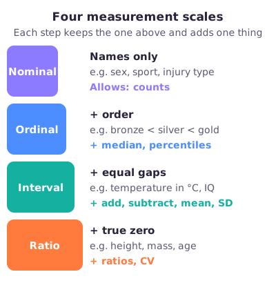
Measurement scales. Every variable sits on one of four scales, and the scale decides which calculations make sense. Nominal variables are names without order (sex, sport): you can only count them. Ordinal variables have an order but unknown gaps (bronze < silver < gold): you may also use the median. Interval variables have equal gaps but an arbitrary zero (temperature in °C, IQ): you may also add, subtract and take a mean and standard deviation (SD). Ratio variables have a true zero, where zero means "none at all" (height, mass, age, elapsed time): only these allow statements like "twice as heavy" and the coefficient of variation (the SD divided by the mean). Coding medals as 1, 2 and 3 does not make them interval.
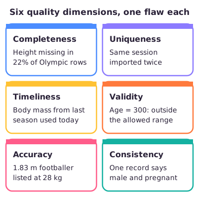
Data quality. A group of data-management experts (the DOMA group) lists six ways data can be bad. Completeness: are values missing? Uniqueness: is any record stored twice? Timeliness: is it up to date? Validity: does each value follow the rules for format, type and range (an age of 300 does not)? Accuracy: does it match reality (a 1.83 m footballer listed at 28 kg does not)? Consistency: do linked facts agree ("male" and "pregnant" on one record do not)? Two cautions from the lecture. A missing value can be information: Medal is empty in 85% of Olympic rows simply because most athletes win nothing. And an extreme value is not automatically an error: the dataset's 25 kg gymnast, 226 cm basketball player and 97-year-old art competitor are all real. Check before you delete.
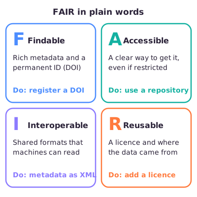
FAIR data. Four principles for storing data so others can find and use it. Findable: rich metadata (a description of every column, its unit and range) plus a permanent ID such as a DOI (Digital Object Identifier, as journal articles have). Accessible: a clear way to get the data from a trusted repository (an online data archive), even if access is restricted for privacy. Interoperable: shared formats that computers can read, such as metadata stored as XML (a structured text format). Reusable: a licence saying what others may do, and a record of where the data came from.
dplyr verbs and the pipe. dplyr is an R package of simple table commands. select() keeps columns; filter() keeps rows that meet a condition; arrange() sorts rows; mutate() adds a column, such as BMI from height and weight; group_by() splits the rows into groups; summarise() turns each group into one row of summary numbers. The pipe %>% passes a table into the next command, so a chain reads like "take the data, and then filter it, and then count the rows". One trap: inside summarise(), n() counts rows including those with a missing value, while mean(age, na.rm = TRUE) skips the missing ages, so the two can be based on different numbers of athletes.
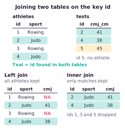
Joins. A join combines two tables by matching rows on a key column, such as an athlete ID. A left join keeps every row of the first table and fills in NA (R's code for "missing") where the second table has no match. An inner join keeps only rows found in both tables. A right join keeps every row of the second table, and a full join keeps everything. If a key appears several times, the rows multiply.
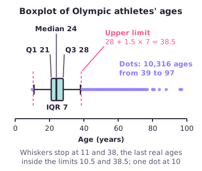
Exploration and boxplots. Exploratory data analysis (EDA) means checking the size and column types, simple summaries and plots before any modelling, and going back to cleaning when something looks wrong. A boxplot draws the middle half of the data as a box from the first quartile (Q1, the value a quarter of the data lies below) to the third quartile (Q3, three quarters below), with the median as a line inside. The whiskers reach to the last values within 1.5 box-widths of the box; values further out are drawn as dots. For Olympic ages, Q1 = 21 and Q3 = 28, so the box is 7 years wide and the upper limit is 28 + 1.5 × 7 = 38.5 years. A dot is a value to check, not an automatic error.
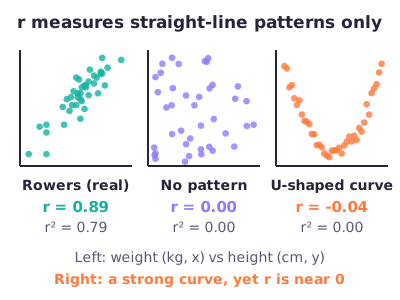
Correlation is not causation. The correlation coefficient r runs from −1 to +1 and measures how closely two variables follow a straight line; Olympians' height and weight correlate at r = 0.8. The share of the variation explained is r squared: 0.8 × 0.8 = 0.64, so 64%, not 80%. A strong correlation can be pure coincidence, especially with few data points: yearly cheese consumption and deaths by tangling in bedsheets correlate at r = 0.95.
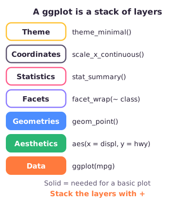
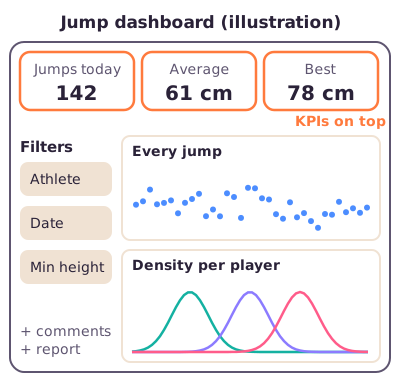
ggplot2 and clear figures. ggplot2 builds a plot from layers added with +: the data; the aesthetics, written aes(), which link variables to the x-axis, y-axis or colour; and a geometry such as geom_point() for dots. Optional layers add facets (one small panel per group), statistics, scales and a theme (background, fonts). Colour inside aes() gives each group its own colour; colour outside aes() paints everything one fixed colour. Good figures are simple, self-explanatory, readable for colour-blind people and use large fonts; a dashboard puts the key performance indicators (KPIs, the few numbers that matter most) on top.
What to be able to do
Name the scale of a variable and say whether a mean, a ratio or a CV makes sense: medal → ordinal, elapsed match time → ratio, temperature in °C → interval.
Show with numbers why a CV needs ratio data: 10 and 20 °C give a CV of 47% in Celsius but 2.5% in kelvin.
Match a data flaw to one of the six quality dimensions, and spot an invented one such as "exactness".
Spell out FAIR and give one practical action for each letter.
Predict the output of a short dplyr pipeline, including what n() and na.rm = TRUE do and why filter() drops rows where the condition cannot be checked (NA).
Write a pipeline that groups by a column, counts rows and averages a variable.
Say which rows a left, right, inner or full join keeps and where NA appears.
Explain why Medal is 85% missing in the Olympics data and how the lecture recodes it.
Calculate the IQR and boxplot limits from Q1 and Q3 (21 and 28 → IQR 7, limits 10.5 and 38.5).
Square r to get explained variance (r = 0.8 → 64%) and explain why a high r does not prove cause.
Pick a chart for a question (histogram, boxplot, violin, scatterplot, bar chart, line graph) and name the advantage of a violin plot over a boxplot (you see the distribution).
Name the ggplot2 layers and write a scatterplot that is coloured by, or split into panels by, a category.
Place a step in the lifecycle: str() → data exploration, ggplot() → data visualization; and name the step that takes most time (data preparation).
Next step
Read the deep dive for the full explanations, diagrams and R examples, then try the practice questions. The full slides are there if you want to see the original pictures.
Got the big picture?Mark the overview done to fill this lecture's ring.
2Step 2 of 312–18 min
Detailed notes
This deep dive teaches everything in Lecture 4 from zero: how to make a raw data table usable (preparation), how to look at it to understand it and catch problems (exploration), and how to show the result in a clear figure (visualization). It follows the lecture's own running example, a table of 120 years of Olympic athletes, and every piece of R code on this page was run and shows its real output. Numbers marked "computed from the course's Olympics file" were checked in the dataset the course provides but are not printed in the lecture. Examples marked Illustration are invented to explain an idea.
Imagine a coach hands you a spreadsheet with 120 years of Olympic results and asks: "Are Olympic champions older than other Olympians?" You cannot answer straight away. Three jobs come first.
Preparation. Make the table usable. Put every height in the same unit, make sure each column holds one kind of value (only numbers, or only text), remove rows that were accidentally stored twice, and decide what an empty cell means. The lecture's motto is "garbage in, garbage out": a clever model fed wrong numbers still gives wrong answers.
Exploration. Look at the table, its simple summaries and quick plots. What is in it? What looks odd? A 25 kg athlete, a 226 cm athlete and a 97-year-old all appear in this dataset. Are they mistakes or real people? (All three turn out to be real.)
Visualization. Make a clear figure that answers the question for someone who was not there, such as a coach or a reader.
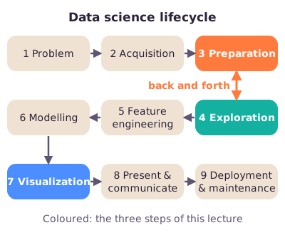
These jobs loop. A plot can reveal a strange value, which sends you back to cleaning. The lecture places them inside the course's "data science lifecycle", the nine steps of a data project from defining the problem to keeping the final product running.
Figure: The data science lifecycle. This lecture covers the three highlighted steps; preparation and exploration go back and forth.
The tools are in R, a free programming language for statistics. Two add-on packages do most of the work: dplyr for reshaping tables and ggplot2 for plots.
Key terms
Every technical word used on this page is listed here in plain words. Each one is explained again, with an example, in the numbered sections.
Tables and R
Data frame — R's name for a table: rows and columns, like a spreadsheet. Example: the Olympics table.
Row (record, observation) — one line of the table, one "thing" measured. Example: one athlete in one event at one Games.
Column (variable) — one kind of information for every row. Example: Height.
Unit of observation — what one row stands for. In the Olympics table it is "an athlete in an event", not "an athlete".
Data type — the kind of value R stores in a column: whole numbers (integer), decimal numbers (double; R calls both "numeric"), text (character) or categories (factor).
Factor — R's type for a categorical variable; it stores each category as a code number plus a label. Example: Sex with labels F and M.
R package — an add-on bundle of functions you install once and load with library(). Example: library(dplyr).
Base R — the functions built into R itself, without loading any package. Example: mean(), unique().
Function and argument — a function is a named command; arguments are what you put inside its brackets. In round(22.84, 1), round is the function and 22.84 and 1 are its arguments (the result is 22.8).
NA — R's code for a missing value ("not available"). Example: an athlete whose height was never recorded.
Tibble — a modern style of data frame that dplyr often prints; it shows each column's type under its name: <chr> text, <int> whole number, <dbl> decimal number.
CSV file — a plain-text table where commas separate the columns; most spreadsheets can save one.
<- (assignment) — stores a result under a name. x <- 5 makes x equal 5.
c() — combines values into a list of values (a vector). Example: c(24, 22, NA, 28).
$ — picks one column from a data frame. athletes$age is the age column.
Defining your own function — cv <- function(v) sd(v) / mean(v) * 100 creates a small command cv() that you can then use like any other.
Kaggle — a website that hosts free datasets and data-science competitions. The Olympics data comes from it.
The data project
Data science lifecycle — the course's nine steps of a data project: problem, acquisition, preparation, exploration, feature engineering, modelling, visualization, presenting, deployment.
Data preparation (wrangling) — cleaning and reshaping raw data until it is usable.
Exploratory data analysis (EDA) — looking at summaries and plots to understand a dataset and find problems before modelling.
Data visualization — turning data or results into figures that explain something.
Feature — a variable used as an input to a model.
Feature engineering — making a new, more useful variable from existing ones. Example: BMI from height and weight.
Time series — repeated measurements of the same thing over time. Example: heart rate every second during a session.
Modelling — fitting a statistical or machine-learning model that predicts or explains an outcome (Lectures 5–7).
BMI (body mass index) — mass in kilograms divided by height in metres squared. Example: 66 kg and 1.70 m give 22.8.
RPE (rating of perceived exertion) — an athlete's own rating of how hard a session felt, for example on a 0–10 scale.
CMJ (countermovement jump) — a vertical jump from standing with a quick dip first; jump height in cm is a common test of leg power.
Measurement and simple statistics
Measurement scale — the type of information a variable carries: nominal, ordinal, interval or ratio. It decides which calculations make sense.
Qualitative (categorical) variable — values are categories. Example: sport.
Quantitative (numerical) variable — values are amounts. Example: height.
Nominal — categories with no order. Example: female/male.
Ordinal — categories with an order but unknown gaps. Example: bronze < silver < gold.
Interval — numbers with equal gaps but an arbitrary zero. Example: temperature in °C.
Ratio — numbers with equal gaps and a true zero (zero means "none at all"). Example: body mass in kg.
Absolute (true) zero — a zero that means the quantity is absent. 0 kg is no mass; 0 °C is not "no temperature".
Median — the middle value after sorting. Example: ages 20, 24, 30 have median 24.
Percentile — the value below which a given percentage of observations fall. The 25th percentile of age is 21 in the Olympics data: a quarter of entries are younger.
Quartiles (Q1, Q3) — the 25th and 75th percentiles. Q2 is the median.
Interquartile range (IQR) — Q3 minus Q1, the width of the middle half of the data.
Standard deviation (SD) — the typical distance of values from their mean.
Standard error of the mean (SEM) — how precisely a sample mean estimates the true mean; SD divided by the square root of the sample size.
Coefficient of variation (CV) — SD divided by the mean, as a percentage; spread relative to size.
Confidence interval and error bars — a 95% confidence interval is a range that, with 95% confidence, contains the true value; error bars draw such a range (or the SD) around a point on a plot.
Distribution — how often each value occurs; the "shape" of a variable.
Skewed distribution — a lopsided distribution with a long tail on one side. Olympic ages have a long tail towards older ages.
Data quality and sharing
Data quality dimension — one of six checks on data quality reported by the DOMA group (a data-management working group; Askham et al., 2013): completeness, uniqueness, timeliness, validity, accuracy, consistency.
Completeness — are the values that should be there actually there?
Uniqueness — is each real thing recorded only once?
Timeliness — is the data recent enough for the moment you need it?
Validity — does each value follow the rules (format, type, allowed range)?
Accuracy — does the value match reality, and are calculations correct?
Consistency — do different pieces of information about the same thing agree?
Duplicate — a row that repeats another row by accident.
Outlier — a value far away from most others. It may be an error or a real, unusual case.
FAIR — Findable, Accessible, Interoperable, Reusable: four principles for sharing data.
Metadata — data about the data: what each column means, its unit, type and allowed range. A "data dictionary" is a metadata file.
DOI (Digital Object Identifier) / persistent identifier — a permanent ID and link for an article or dataset. Example: every journal article has one, printed as doi.org/10.…
Repository — a trusted online archive that stores datasets, often handing out DOIs.
XML — a structured text format that computers can read easily; good for metadata.
Interoperable — able to be combined with other data and tools because it uses shared formats and vocabularies.
Licence — the terms that say who may reuse data and how.
Provenance — where the data came from and what was done to it.
dplyr and joins
dplyr — the R package for table wrangling; its main functions are called "verbs".
select() — keep chosen columns.
filter() — keep rows that meet a condition.
arrange() — sort rows; desc() sorts from high to low.
mutate() — add a new column or change one, keeping all rows.
group_by() — tell R which groups later steps should work within.
summarise() — collapse each group into one row of summary numbers.
n() — inside summarise(), counts the rows in each group.
na.rm = TRUE — "remove NAs": an argument that tells a function such as mean() to skip missing values.
Logical operators — == "is equal to", & "and" (both true), | "or" (at least one true), > "greater than".
Pipe %>% — passes the table on its left into the next function, so steps read top to bottom like "and then".
SQL — the standard language for querying databases; dplyr verbs mirror its commands.
Join — combining two tables by matching rows on a shared column.
Key (matching variable) — the column or columns used to match rows in a join. Example: athlete ID.
Left, right, inner, full join — keep all rows of the left table, of the right table, only matching rows, or all rows of both.
Semi and anti join — keep rows of the first table that do, or do not, have a match; they add no columns.
Many-to-many join — a join where a key repeats in both tables, so rows multiply.
Imputation — filling in missing values with estimates (Lecture 7).
Plots and relationships
Histogram — bars showing how many values fall into each range (bin) of one numerical variable.
Bin — one range of values used to group numbers. Example: ages 20–24.
Bar chart — bars showing a count or value per category.
Line graph — values connected over an ordered sequence, usually time.
Boxplot — a compact picture of a distribution: median, quartiles, whiskers and outlier dots.
Whisker — the line from the box to the most extreme value that is not flagged as an outlier.
Violin plot — a boxplot-like plot whose width shows how densely values cluster at each level.
Density — a smoothed version of a histogram: how concentrated values are around each point.
Scatterplot — one dot per observation, with one variable on each axis.
Opacity (alpha) — how see-through dots are; with semi-transparent dots, dark areas show many overlapping points.
Correlation coefficient (r) — a number from −1 to +1 for how closely two variables follow a straight-line pattern.
Correlation plot (corrplot) — a grid showing r for every pair of variables.
Explained variance (R²) — the share of the variation in one variable that a straight-line model with the other variable accounts for; for two variables it equals r².
Simple linear regression — fitting one straight line that predicts one variable from another (Lecture 5).
Predictor and intercept — the predictor is the input variable of a regression; the intercept is the line's starting value when the predictor is zero.
Spurious correlation — a strong correlation between things that have nothing to do with each other.
Causation — one thing actually changing another.
ggplot2 and reporting
ggplot2 — R's main plotting package; it builds a plot from layers joined with +.
Aesthetic mapping (aes()) — linking a variable to a visual property, such as x position, y position or colour.
Geom — the kind of mark drawn: points, lines, bars. Functions start with geom_.
Facet — splitting one plot into small panels, one per group.
Stat (statistics layer) — derived summaries drawn on the plot, such as means with error bars.
Scale and coordinates — how data values turn into axis positions, ticks, labels and colours (scale_ functions).
Theme — the look of everything that is not data: background, fonts, legend position.
Legend — the key next to a plot that explains what each colour or symbol means.
Axis ticks (breaks) — the marks and numbers along an axis.
mpg — a practice dataset built into ggplot2: 234 cars with engine size (displ, litres), highway miles per gallon (hwy) and car type (class).
Dashboard — one screen that combines the key numbers, filters and plots for a user.
KPI (key performance indicator) — one of the few numbers that matter most to the user. Example: a player's average jump height this week.
R Shiny — an R package for building interactive web dashboards.
1. Preparation comes first: garbage in, garbage out
Plain definition. Data preparation (also called wrangling) is everything you do to raw data so it can be trusted and analysed: fixing formats and units, tidying the layout and checking quality.
Why it matters. If the input is wrong, every later step is wrong too, however clever the model. That is "garbage in, garbage out".
From the lecture: data scientists typically spend 60–80% of their time on data preparation, especially when the data was collected by others or for a different purpose (04:07).
The lecture lists two groups of preparation tasks.
A. Standardize the format.
Data type consistency. Each column should hold one data type. Illustration: if one height is typed as "1.80 m" (text) and the rest as 180 (number), R reads the whole column as text and cannot average it.
Data scale consistency. Each column should keep one measurement scale and one range (Section 2 explains scales). Illustration: RPE (rating of perceived exertion) recorded on a 0–10 scale for some sessions and on the older 6–20 RPE scale (the Borg scale) for others cannot be compared.
Consistent records and units. Every height in the same unit, every date in the same format. In the lecture's Exercise 1 you convert height from centimetres to metres before calculating BMI.
B. Organize and tidy the data.
Decompose complex values. Split a value that hides two pieces of information. Real example: the Olympics column Games holds values like "1992 Summer", which combines a year and a season. The dataset also has separate Year and Season columns, which are easier to filter and plot.
Aggregate into bins. Group numbers into ranges. A histogram does this when it counts ages 20–24, 25–29 and so on. The same idea is used later in the course to build new features (model inputs) from time series (measurements taken over time).
Analogy: preparation is the chef's chopping and washing before cooking. Nobody sees it, it takes most of the time, and skipping it ruins the meal.
Exam angle. "In which lifecycle step do you spend most of your time?" The 2024 practice exam's grading gave 1 point for data preparation (preprocessing) and only 0.5 for exploration, plus points for the motivation. The answer to give is data preparation, 60–80% of the time, because you must check that the data make sense before anything else.
In short: wrong or messy input gives wrong output, so fix types, scales, units and layout first; it takes most of a data scientist's time.
2. Measurement scales: what each number allows
Plain definition. Every variable sits on one of four measurement scales. Each scale adds one property to the one before.
Qualitative (categories)
Nominal: names only, no order. Examples from the lecture: female/male. Others: sport, injury type.
Ordinal: names plus an order, but the gaps are unknown. Example from the lecture: gold/silver/bronze.
Quantitative (numbers)
Interval: order plus equal gaps, but zero is arbitrary (a convention, not "none"). Examples from the lecture: temperature in °C, IQ.
Ratio: equal gaps plus a true zero. Examples from the lecture: age, height (also weight, elapsed time).
Figure: Each step up the staircase keeps everything below it and adds one property, and with it one more kind of calculation.
The characteristics table. The lecture shows this table to compare the scales.
Scale
Order?
Equal gaps?
Zero point
Nominal
No
No
None
Ordinal
Yes
No
Arbitrary
Interval
Yes
Yes
Arbitrary
Ratio
Yes
Yes
Absolute
What you may compute. This is the table the lecturer stressed most.
Scale
Allowed
Not meaningful
Nominal
Counts (frequency distribution)
Median, adding, mean, ratios
Ordinal
Counts, median, percentiles
Adding/subtracting, mean, SD, ratios
Interval
All of the above + add/subtract, mean, SD, SEM
Ratios, CV
Ratio
Everything, including ratios and CV
—
Why ordinal values cannot be added. The gap between categories is not a fixed amount. Illustration: a pain score of none = 0, mild = 1, moderate = 2, severe = 3. Is "mild to moderate" the same amount of extra pain as "moderate to severe"? Nobody knows, so a mean of 1.5 has no clear meaning. The median ("the middle patient reports mild pain") does.
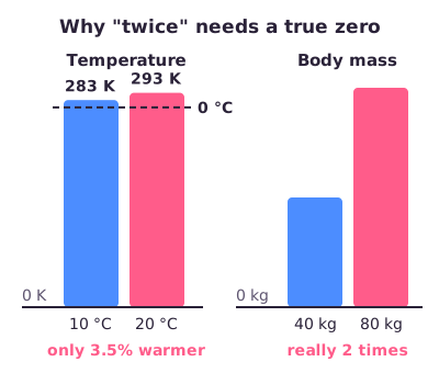
Why "twice as much" needs a true zero. A ratio such as "twice as heavy" only works when zero means "none at all".
Figure: 20 °C looks like "twice" 10 °C only because the Celsius zero is arbitrary. Measured from the true zero (0 kelvin), it is just 3.5% more. 80 kg really is twice 40 kg.
Why the CV needs ratio data. The coefficient of variation compares the spread to the size of the values:
In words: the standard deviation as a percentage of the mean.
Worked example: Two training-room temperatures, 10 °C and 20 °C. Question: what is their CV? We compute it in three temperature units that describe exactly the same two days.
In °C the two values have mean 15 and SD 7.07, so the CV is 7.07 / 15 = 47%.
The same two days in °F (50 and 68) give 22%, and in kelvin 2.5%.
Same reality, three different answers: the CV of interval data depends on where someone put the zero, so it is meaningless.
Two body masses, 60 and 80 kg, give a CV of 20.2% in kilograms and exactly the same in pounds. Changing the unit of ratio data multiplies every value (and the SD and the mean) by the same factor, which cancels out.
From the lecture: about the CV row of the "what you may compute" table the lecturer said "definitely remember this one" (09:35). Only ratio data allow a CV.
Common confusion: numbers do not make a variable quantitative. Coding bronze = 1, silver = 2, gold = 3 does not turn medals into an interval variable. The codes are still just ordered labels, so "gold = 3 × bronze" is nonsense. The same goes for shirt numbers (nominal).
Exam note: In the recording (about 08:30) the lecturer's wording about kelvin comes out garbled, as if kelvin had no absolute zero. Kelvin does have an absolute zero (0 K is the lowest possible temperature), so temperature in kelvin is ratio; temperature in °C is interval. Follow the slides: temperature (°C) and IQ are interval; age and height are ratio.
Exam angle.
The 2022–2023 test exam asked for the scale of a medal variable (gold, silver or bronze): ordinal.
The 2024 practice exam combined jump height in cm (ratio), serve quality coded with the symbols #, −, ! and + (ordered categories: ordinal) and elapsed time during a match in minutes (ratio: 0 minutes means no time has passed). Watch the difference with clock time or calendar year, which have an arbitrary zero and are interval.
In short: nominal = names, ordinal = + order, interval = + equal gaps, ratio = + true zero; means and SDs need interval or ratio data, and ratios and the CV need ratio data.
3. Data quality: six ways data can be bad
Plain definition. Data quality is how fit the data is for its purpose. Any item, record, dataset or database can be measured or assessed for quality. The lecture uses six dimensions reported by the DOMA group (Askham et al., 2013).
Dimension
Question it asks
Completeness
What proportion of the data is stored? (missing values)
Uniqueness
Is any record identified more than once? (duplicates)
Timeliness
Does it show reality at the required moment? (when updated?)
Validity
Does it follow the defined syntax: format, type, range?
Accuracy
Does it describe the real-world object or event? (correct calculations?)
Consistency
Do different representations conflict?
Figure: One concrete flaw for each dimension. Learn the pairings: exam questions give a flaw and ask for the dimension.
One concrete flaw each.
Completeness: height is missing in 60,171 of the 271,116 Olympic rows (22%).
Uniqueness:Illustration: the same training session is imported twice from a sports watch, so weekly load is counted double.
Timeliness:Illustration: a squad's body masses were last updated a season ago, but you use them to plan this month's nutrition.
Validity: an age of 300, which the lecturer used as his example. It breaks the allowed range for age. Other validity failures: a date such as 31/02/2024 that cannot exist, or a medal label "Gld" that is not in the list of allowed categories.
Accuracy: in the Olympics data, a 1.83 m footballer is recorded at 28 kg, giving a BMI of 8.4. The value has a valid format and passes a simple weight range check (real athletes of 25 kg exist), but it almost certainly does not match the real person. A wrong calculation also counts: BMI computed with height in centimetres instead of metres.
Consistency: the lecture's example is a record that says "male" and "pregnant" at the same time. Treat such a conflict as a reason to check the record, for example how the sex variable was defined, rather than as automatic proof of an error. Illustration: one file gives an athlete's date of birth as 3 May 2001 and another as 5 March 2001.
From the lecture: missing values are not always the worst case. Keeping an impossible value such as an age of 300 silently distorts the mean, and sometimes the fact that a value is missing is information in itself (10:28; Section 10 shows the medal example).
From the lecture: identify duplicates by comparing several columns together, because a single column such as age repeats naturally (12:02; Section 9).
An extreme value is not automatically an error. The Olympics data contains a 25 kg gymnast, a 226 cm basketball player and a 97-year-old competitor. All three are real (Section 11). Investigate before you delete.
Exam note: The 2024 practice exam asked which quality dimension an age of 156 relates to, with the options uniqueness, completeness, accuracy and timeliness. Validity was not offered. Of those four, only accuracy fits: the value cannot describe a real person. If both validity and accuracy are offered, read the wording: "outside the allowed range or format" points to validity; "does not match reality" points to accuracy.
Exam angle. The 2022–2023 test exam asked which option is not a DOMA dimension; "Exactness" was the odd one out. Memorize the six: completeness, uniqueness, timeliness, validity, accuracy, consistency.
In short: check completeness, uniqueness, timeliness, validity, accuracy and consistency; investigate odd values in context before deleting them.
4. FAIR data: making data usable by others
Plain definition. FAIR is a set of four principles for storing and sharing research data so that others (and you, later) can find it and use it correctly.
Figure: What each FAIR letter means in plain words, and the practical action the lecturer recommended for it.
Findable. The data and its supporting material have rich metadata and a unique, persistent identifier. Action: store the dataset in a repository and get a DOI for it, just as journal articles have one.
Accessible. People and computers can retrieve the data and metadata through a clear procedure; the data sits in a trusted repository. Accessible does not mean public: data with privacy restrictions can still be FAIR if the access procedure is clear.
Interoperable. The metadata uses a formal, shared, widely used language, so the data can be combined with other data and read by machines. Action: the lecturer advised storing metadata in XML (or following an XML structure), which computers can read.
Reusable. The data has a clear usage licence and accurate information on its provenance (where it came from and how it was processed). Action: attach a licence saying what others may do with it.
Why it matters. Without FAIR practices, a dataset becomes a puzzle a year later. Illustration: a column called height holding 180 says nothing about units or method. A metadata file that says "standing height in cm, measured barefoot" gives it meaning.
From the lecture: for your own thesis data, write a metadata file describing every column (content, type, range), get a DOI from a repository, store the metadata as XML and add a licence (14:05).
Analogy: a library book. The catalogue number lets you find it (findable), the lending desk has rules for borrowing it (accessible), it is written in a common language with standard chapter labels (interoperable), and the copyright page says who wrote it, which edition it is and what you may copy (reusable).
Common confusion. FAIR helps reproducibility, but it does not prove the measurements are correct. A perfectly documented dataset can still contain wrong values.
Exam angle. Two reference exams asked what FAIR stands for. The answer is Findable – Accessible – Interoperable – Reusable. Distractors such as "Formulated", "Individualized" and "Reviewed" are wrong.
In short: FAIR = findable (DOI, metadata), accessible (clear retrieval procedure, even if restricted), interoperable (shared machine-readable formats), reusable (licence, provenance).
5. The running example: 120 years of Olympic data
What it is. The lecture uses the Kaggle dataset "120 years of Olympic history: athletes and results" (by rgriffin, built from www.sports-reference.com). It covers every Games from Athens 1896 to Rio 2016 and has a CC0 public-domain licence (free for anyone to use). The course provides it as data_olympics.RData, which loads as a data frame called data_olympics.
load("data_olympics.RData")   # creates the data frame data_olympics
dim(data_olympics)            # number of rows, number of columns
# [1] 271116     15
The 15 columns:ID, Name, Sex, Age, Height (cm), Weight (kg), Team, NOC (country code), Games, Year, Season, City, Sport, Event and Medal.
What one row is. One row is one athlete in one event at one Games. An athlete who swam four events at two Games has eight rows. So 271,116 rows does not mean 271,116 people: there are 135,571 different athlete IDs (computed from the course's Olympics file). Always check the unit of observation before you count anything.
In short: 271,116 rows × 15 columns, one row per athlete per event per Games, 1896–2016.
6. Wrangling with dplyr: choose, sort and create
Plain definition. dplyr is an R package whose functions ("verbs") each do one simple job on a table. Because each step is a plain-English word, a chain of steps stays easy to read. The lecturer also recommended the free dplyr "cheat sheet" (search for it online) for an overview of all functions.
dplyr verb
What it does
SQL equivalent
select()
Choose columns
SELECT
filter()
Choose rows
WHERE
group_by()
Group the data
GROUP BY
summarise()
Summarise each group
—
arrange()
Sort rows
ORDER BY
join() (e.g. left_join())
Combine two tables
JOIN
mutate()
Create new variables
column alias
To see each verb clearly we use a tiny invented table of four athletes (Illustration). Every output below is real R output.
library(dplyr)
athletes <- data.frame(          # data.frame() builds a table column by column
  id        = 1:4,                # 1:4 means 1, 2, 3, 4
  sport     = c("Rowing", "Judo", "Rowing", "Judo"),
  height_cm = c(190, 170, 180, 175),
  weight_kg = c(88, 66, 75, 81),
  age       = c(24, 22, NA, 28)
)
athletes
#   id  sport height_cm weight_kg age
# 1  1 Rowing       190        88  24
# 2  2   Judo       170        66  22
# 3  3 Rowing       180        75  NA
# 4  4   Judo       175        81  28
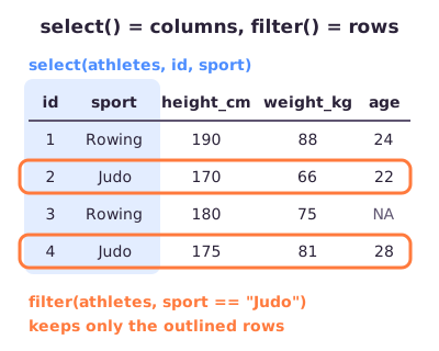
Figure:select() works on columns (vertical); filter() works on rows (horizontal).
filter() keeps rows that meet a condition. Before: 4 rows. After: only the 2 judoka. Note the double ==, which means "is equal to"; a single = is used for naming arguments.
filter(athletes, sport == "Judo")
#   id sport height_cm weight_kg age
# 1  2  Judo       170        66  22
# 2  4  Judo       175        81  28
arrange() sorts rows. It sorts from low to high by default; wrap the column in desc() to sort from high to low.
arrange(athletes, desc(height_cm))
#   id  sport height_cm weight_kg age
# 1  1 Rowing       190        88  24
# 2  3 Rowing       180        75  NA
# 3  4   Judo       175        81  28
# 4  2   Judo       170        66  22
mutate() adds columns and keeps every row.round(x, 1) rounds to one decimal. BMI needs height in metres, so we first make height_m and then use it straight away in the same mutate() call; dplyr creates the new columns in order, from left to right.
In words: body mass divided by height squared, with height in metres.
Check one by hand: athlete 2 weighs 66 kg and is 1.70 m tall, so BMI = 66 / (1.70 × 1.70) = 66 / 2.89 = 22.8. If you forgot to convert and used 170 cm, you would get 66 / 28,900 = 0.002, a nonsense value. That is an accuracy problem caused by a unit error.
Combining conditions in filter().& means both conditions must be true; | means at least one must be true.
filter(athletes, sport == "Judo" | age > 23)   # Judo OR older than 23
#   id  sport height_cm weight_kg age
# 1  1 Rowing       190        88  24
# 2  2   Judo       170        66  22
# 3  4   Judo       175        81  28
filter(athletes, sport == "Judo" & age > 23)   # Judo AND older than 23
#   id sport height_cm weight_kg age
# 1  4  Judo       175        81  28
Look at athlete 3 in the OR result: a rower whose age is NA. "Is NA older than 23?" has no answer, so R gives NA instead of TRUE, and filter() keeps only rows where the condition is TRUE. Athlete 3 is silently dropped.
The lecture's warm-up exercise on the Olympics data. Select the host city, sort by year from high to low, and check the type of the height column.
head(select(data_olympics, City), 3)               # head() shows the first rows only
#        City
# 1 Barcelona
# 2    London
# 3 Antwerpen
head(select(arrange(data_olympics, desc(Year)), Year, City), 3)
#   Year           City
# 1 2016 Rio de Janeiro
# 2 2016 Rio de Janeiro
# 3 2016 Rio de Janeiro
typeof(data_olympics$Height)                       # typeof() reports the data type; $ picks one column
# [1] "integer"
data_olympics <- mutate(data_olympics, Height = as.numeric(Height))   # as.numeric() converts to numbers
typeof(data_olympics$Height)
# [1] "double"
The lecture showed two equivalent ways to convert: mutate(data_olympics, Height = as.numeric(Height)) or data_olympics$Height <- as.numeric(data_olympics$Height). In the course file height is already a whole number (integer), so the conversion just makes it a decimal number (double); both count as numeric.
Correction: converting a factor straight to numbers gives its internal codes, not the values you see.
h <- factor(c("180", "170", "190"))
as.numeric(h)                   # level codes, not heights!
# [1] 2 1 3
as.numeric(as.character(h))     # convert to text first, then to numbers
# [1] 180 170 190
Lecture Exercise 1: the lowest BMI. Change height from cm to m, create BMI with mutate(), sort by BMI from low to high and find what kind of athlete has the lowest BMI.
data_olympics <- mutate(data_olympics,
                        Height = Height / 100,
                        BMI = Weight / Height^2)
head(select(arrange(data_olympics, BMI), Name, Height, Weight, Sport, BMI), 3)
#                             Name Height Weight      Sport       BMI
# 1 Albert Ferdinand "Al" Zerhusen   1.83     28   Football  8.360954
# 2 Lia Henrique da Silva Nicolosi   1.69     30 Volleyball 10.503834
# 3                 Bndicte Evrard   1.76     38 Gymnastics 12.267562
The answer is a football player (United States, 1956): 1.83 m and 28 kg, BMI 8.4. A healthy adult BMI is roughly 18.5–25, so a footballer at 8.4 is almost certainly a data-entry error in weight. This is exactly the loop the lecturer described: you create a feature (BMI), inspect it, see an impossible value, and go back to check the raw weight. ("Bndicte" is how the file stores the name Bénédicte: the accented letters were lost when the file was saved, a small accuracy flaw.)
Common confusion.select() = columns, filter() = rows. mutate() keeps all rows and adds columns; summarise() (next section) shrinks the table to one row per group.
In short: select columns, filter rows (& = both, | = either; NA conditions are dropped), arrange to sort (desc() for high to low), mutate to add columns.
7. The pipe %>% and grouped summaries
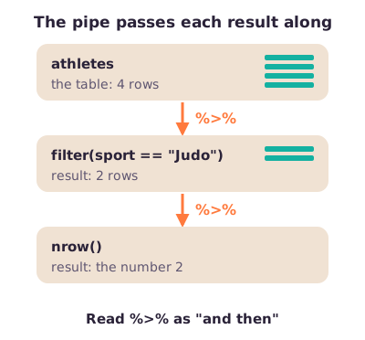
Plain definition. The pipe %>% takes whatever is on its left and passes it in as the first argument of the function on its right. Read it as "and then".
# general pattern (not runnable: data_frame, variable and value are placeholders)
filter(data_frame, variable == value)
# is exactly the same as
data_frame %>% filter(variable == value)
The pipe is not limited to filter(); it works with any function. Its logo is a pun on Magritte's painting of a pipe: "Ceci n'est pas un pipe".
Figure: Data flows down the pipe; each step receives the previous step's result.
Why it matters. Without the pipe you must nest functions inside each other and read them inside-out. With the pipe, a five-step analysis reads top to bottom.
From the lecture:nrow() needs nothing inside its brackets here, because the pipe already hands it the filtered table (54:19).
Analogy: an assembly line. Each station does one job and passes the product to the next station.
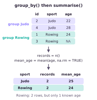
group_by() + summarise(): one row per group.group_by() alone changes nothing you can see except a note that the table is grouped. summarise() then collapses each group into one row.
Figure:group_by() sorts rows into groups; summarise() turns each group into one row.
The lecture's summary example uses the built-in mpg car data: group the cars by manufacturer and average the number of cylinders.
mpg %>%
  group_by(manufacturer) %>%
  summarise(cyl = mean(cyl))
# first 3 of 15 rows:
#   manufacturer   cyl
# 1 audi          5.22
# 2 chevrolet     7.26
# 3 dodge         7.08
Lecture Exercise 2 on the Olympics data.
Part 1: how many rows are from 2008 or won gold?
data_olympics %>% filter(Year == 2008 | Medal == "Gold") %>% nrow()
# [1] 26303
data_olympics %>% filter(Year == 2008 & Medal == "Gold") %>% nrow()   # for comparison: AND
# [1] 671
With OR, either condition is enough: 26,303 rows. With AND, both must hold: only 671 rows are gold medals won in 2008. (These two counts are computed from the course's Olympics file; the lecture shows only the code.)
Part 2: group by medal, then count rows and average age.
data_olympics %>%
  group_by(Medal) %>%
  summarise(N = n(),
            Age = mean(Age, na.rm = TRUE))
# # A tibble: 4 × 3
#   Medal       N   Age
#   <chr>   <int> <dbl>
# 1 Bronze  13295  25.9
# 2 Gold    13372  25.9
# 3 Silver  13116  26.0
# 4 <NA>   231333  25.5
Inside summarise(), the name on the left of = is the new column's name (N and Age are the lecturer's choices; number_of_athletes would work just as well) and the right side is how to calculate it, just like in mutate(). You can create several summary columns at once, separated by commas. The fourth group, <NA>, holds the 231,333 rows without a medal; Section 10 shows why that matters.
Common confusion. The pipe %>% is for passing data between dplyr steps. ggplot2 joins plot layers with + instead (Section 15).
Exam angle. The 2022–2023 test exam asked for code to count training sessions per skater type (all-round or sprint speed skaters). The pattern is:
# pattern only: the exam's data_sports table is not provided
data_sports %>%
  group_by(Skater_type) %>%
  summarise(number = n())
It also asked for a longer pipeline: compute body surface area (BSA, the total skin area of the body in m²) with the formula BSA = 0.007184 × Weight^0.425 × Height(cm)^0.725, average it per sport and list the 10 sports with the lowest values. In the exam's table, as in our table after Exercise 1, height is in metres, so the code multiplies it by 100 inside the formula:
data_olympics %>%
  mutate(BSA = 0.007184 * Weight^0.425 * (Height * 100)^0.725) %>%     # Height is in m; formula needs cm
  group_by(Sport) %>%
  summarise(BSA = mean(BSA, na.rm = TRUE)) %>%
  arrange(BSA) %>%
  head(10)
# first 3 of 10 rows:
#   Sport                   BSA
# 1 Rhythmic Gymnastics    1.54
# 2 Gymnastics             1.60
# 3 Synchronized Swimming  1.63
In short:%>% means "and then"; group_by() + summarise() gives one row per group; n() counts rows including those with NA, while mean(..., na.rm = TRUE) uses only the known values.
8. Joining tables
Plain definition. A join combines two tables by matching rows that share the same value in a key column. Illustration: one table holds athlete details, another holds countermovement-jump (CMJ) test results (a vertical jump from standing, measured in cm), and both have an athlete id.
Why it matters. Real projects spread data over several files: raw data and summary data, wellness questionnaires and training logs. The lecturer noted that in the course assignment you can combine the raw and summary data with joins.
Figure: A left join keeps every row of the first table and fills NA where there is no match; an inner join keeps only matches.
tests <- data.frame(id = c(2, 4, 5), cmj_cm = c(41, 38, 45))
a <- select(athletes, id, sport)
left_join(a, tests, by = "id")
#   id  sport cmj_cm
# 1  1 Rowing     NA
# 2  2   Judo     41
# 3  3 Rowing     NA
# 4  4   Judo     38
inner_join(a, tests, by = "id")
#   id sport cmj_cm
# 1  2  Judo     41
# 2  4  Judo     38
right_join(a, tests, by = "id")
#   id sport cmj_cm
# 1  2  Judo     41
# 2  4  Judo     38
# 3  5  <NA>     45
full_join(a, tests, by = "id")
#   id  sport cmj_cm
# 1  1 Rowing     NA
# 2  2   Judo     41
# 3  3 Rowing     NA
# 4  4   Judo     38
# 5  5   <NA>     45
Join
Keeps
Unmatched rows
Left
All rows of the first table
Get NA in the second table's columns
Right
All rows of the second table
Get NA in the first table's columns
Inner
Only ids in both
Dropped
Full
All rows of both
NA wherever there is no partner
The lecture also shows a Venn diagram with dataset 1 in yellow, dataset 2 in blue and their overlap in green: inner = green; left = yellow + green; right = blue + green; full = yellow + green + blue. Two "filtering joins" add no columns: a semi join keeps the rows of the first table that have a match (green part of dataset 1), and an anti join keeps those that do not (yellow minus green).
semi_join(a, tests, by = "id")
#   id sport
# 1  2  Judo
# 2  4  Judo
anti_join(a, tests, by = "id")      # athletes who were never tested
#   id  sport
# 1  1 Rowing
# 2  3 Rowing
The lecture's own left-join example. Table df has columns x and y; table dj has columns y and z. The key is y.
df <- data.frame(x = c(1, 23, 4, 43, 2, 17), y = c("a", "b", "b", "b", "a", "d"))
dj <- data.frame(y = c("a", "b", "c"), z = c("apple", "pear", "orange"))
left_join(df, dj, by = "y")
#    x y     z
# 1  1 a apple
# 2 23 b  pear
# 3  4 b  pear
# 4 43 b  pear
# 5  2 a apple
# 6 17 d  <NA>
All six rows of df survive. Each a gets "apple" and each b gets "pear". The row with y = d has no partner, so z is NA. "Orange" (y = c) does not appear because c is not in the left table.
Three rules about keys.
Rule 1: a key can be one or several columns.by = c("ID", "Year") matches on athlete and year together.
Rule 2: if you do not say by, dplyr uses every column name the two tables share, and prints which ones it used. Check that those columns really define a match.
left_join(a, tests)
# Joining with `by = join_by(id)`
(The lecture's slide shows the older wording of this message, Joining, by = c("ID", "Year").)
Rule 3: the key can have different names in the two tables. Write first-table name = second-table name:
tests2 <- rename(tests, athlete_code = id)      # rename(new = old)
left_join(a, tests2, by = c("id" = "athlete_code"))
# same 4 rows as the left join above
In the lecture the first table's column was renamed to Athlete_code, so the code read left_join(df1, df2, by = c("Athlete_code" = "ID")).
Common confusion: repeated keys multiply rows. If athlete 2 has three test results, a left join gives three rows for athlete 2.
That can be what you want (one row per test) or an accident. In the lecture's demonstration both tables were cut from the Olympics data itself, where one athlete has many rows. Computed from the course's Olympics file:
271,116 rows became more than a million, because every row of an athlete was paired with every other row of the same athlete. The lecturer said joining a table to itself like this "doesn't make a lot of sense"; it is only a demonstration. Normally you join different tables about the same athletes.
Exam angle. Be able to say which ids survive each join and where NA appears, and to write left_join(x, y, by = "key").
In short: a join matches rows on a key; left keeps all of the first table, right all of the second, inner only matches, full everything; unmatched cells become NA, and repeated keys multiply rows.
9. Duplicates
Plain definition. A duplicate is a row that repeats another row. R has three tools:
duplicated() (base R) marks each element or row that already appeared earlier (TRUE) or not (FALSE).
unique() (base R) keeps only the unique elements.
distinct() (dplyr) is an efficient way to remove duplicate rows from a table, optionally looking only at chosen columns.
Illustration: a session log where one session was imported twice. RPE is the athlete's rating of perceived exertion.
sessions <- data.frame(id = c(1, 1, 2, 2), date = c("3 Oct", "3 Oct", "3 Oct", "5 Oct"), rpe = c(6, 6, 7, 5))
duplicated(sessions)
# [1] FALSE  TRUE FALSE FALSE
distinct(sessions)
#   id  date rpe
# 1  1 3 Oct   6
# 2  2 3 Oct   7
# 3  2 5 Oct   5
distinct(sessions, id)         # distinct on one column only
#   id
# 1  1
# 2  2
unique(c(24, 22, 24, 28))
# [1] 24 22 28
Row 2 is an exact copy of row 1, so it is flagged and removed. Athlete 2's two sessions differ in date, so both are kept. But distinct(sessions, id) keeps one row per athlete and throws the second session away. Removing "duplicates" on too few columns destroys real repeated measurements.
The lecture's Olympics example. Keep only ID, name and age, then remove duplicates.
84,039 rows disappear (271,116 − 187,077). Are they errors? No. An athlete who competed in several events at one Games has several rows with the same ID, name and age, and these collapse into one once the event column is dropped. With every column kept, only 1,385 rows are exact copies (271,116 → 269,731, computed from the course's Olympics file).
From the lecture: filtering for the lightest athlete (25 kg) shows the same gymnast six times with identical name, age and sport; they are six different events at the same Games (82:18; Section 11 lists them).
Why it matters. How many "duplicates" you find depends entirely on which columns you compare. Decide what one true record is (an athlete? an athlete per event?) before removing anything.
In short: use duplicated(), unique() and distinct(), but identify duplicates on several columns together, because rows that look identical on a few columns are often different real events.
10. Missing values
Plain definition. A missing value is a cell with no recorded value; R writes it as NA.
Finding them. Use is.na(). Never use == NA: comparing anything with an unknown gives an unknown, not TRUE or FALSE.
athletes$age == NA
# [1] NA NA NA NA
is.na(athletes$age)
# [1] FALSE FALSE  TRUE FALSE
colSums(is.na(athletes))       # missing cells per column
#        id     sport height_cm weight_kg       age
#         0         0         0         0         1
is.na() turns the table into TRUE/FALSE values; colSums() adds them up per column, because TRUE counts as 1.
The lecture's Olympics counts (after Exercise 1 added the BMI column):
colSums(is.na(data_olympics))
#     ID   Name    Sex    Age Height Weight   Team    NOC  Games   Year Season
#      0      0      0   9474  60171  62875      0      0      0      0      0
#   City  Sport  Event  Medal    BMI
#      0      0      0 231333  64263
round(colSums(is.na(data_olympics)) / nrow(data_olympics) * 100, 1)   # as % of rows
#     ID   Name    Sex    Age Height Weight   Team    NOC  Games   Year Season
#    0.0    0.0    0.0    3.5   22.2   23.2    0.0    0.0    0.0    0.0    0.0
#   City  Sport  Event  Medal    BMI
#    0.0    0.0    0.0   85.3   23.7
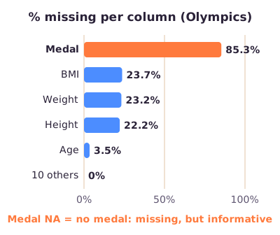
Figure: Percentage of missing values per column in the Olympics data. The lecture showed the same information as a "missing values plot".
Worked example: what do these numbers mean?
Age 3.5%: 9,474 of 271,116 rows have no age. A small problem.
Height 22.2% and Weight 23.2%: roughly one row in five lacks body size. These gaps are mostly in early Games: 82% of the missing heights are from Games before 1960 (computed from the course's Olympics file).
BMI 23.7%: BMI is missing whenever height or weight is missing, so it has slightly more NAs than either.
Medal 85.3%: 231,333 rows have no medal. This is not a data-entry failure.
Missingness as information. Only three medals are given per event, so most entries never win one. Here NA means "no medal". It can be recoded with ifelse(test, value if TRUE, value if FALSE):
data_olympics <- data_olympics %>%
  mutate(Medal = ifelse(is.na(Medal), "No medal", Medal))
table(data_olympics$Medal)     # table() counts each value
#   Bronze     Gold No medal   Silver
#    13295    13372   231333    13116
From the lecture: the lecturer called this recoding "kind of assuming a little bit", but sensible here: the missing values disappear and the column gains a real category (73:57).
Analogy: an empty seat at a lecture. Sometimes it means the register is incomplete; sometimes it simply means the student did not come. You have to know which before you fill it in.
What to do with missing values is mostly Lecture 7 (imputation: filling values in with estimates). In this lecture, first understand how many are missing, where, and why.
Common confusion.n() counts rows including NAs; mean(x, na.rm = TRUE) uses only known values. So "records" and "observed values" can differ (Section 7).
In short: find NAs with is.na() and colSums(); ask why they are missing; sometimes NA carries meaning (Medal NA = no medal) and can be recoded.
11. Exploratory data analysis (EDA)
Plain definition. EDA is the process of visualizing and analysing data to extract insights from it: summarizing its important characteristics to understand the dataset better. The lecture lists four aims: maximize insight into a dataset, uncover its underlying structure, extract the important variables, and focus on visualization.
Why it matters. EDA lets you (1) form assumptions and hypotheses for your modelling and (2) check the data quality, so you know what still needs processing and cleaning. After EDA you often go back to preparation: it is an iterative process. It also suggests new features. Illustration (from the lecturer's speed-skating aside): plotting a variable for intensive versus extensive interval sessions side by side may suggest a threshold that separates them.
How to start (three steps from the lecture).
Inspect the size and structure:dim() (rows and columns), colnames() (column names), head() (first six rows), str() (each column's type and first values).
Calculate and plot simple statistics:summary(), means, SDs, boxplots.
Plot the raw data: histograms, scatterplots, correlation plots.
Worked example: the Olympics summary. Reloading the original file (height in cm again):
load("data_olympics.RData")
data_olympics %>% select(Age, Height, Weight) %>% summary()
#       Age            Height          Weight
#  Min.   :10.00   Min.   :127.0   Min.   : 25.0
#  1st Qu.:21.00   1st Qu.:168.0   1st Qu.: 60.0
#  Median :24.00   Median :175.0   Median : 70.0
#  Mean   :25.56   Mean   :175.3   Mean   : 70.7
#  3rd Qu.:28.00   3rd Qu.:183.0   3rd Qu.: 79.0
#  Max.   :97.00   Max.   :226.0   Max.   :214.0
#  NAs    :9474    NAs    :60171   NAs    :62875
table(data_olympics$Sex)
#      F      M
#  74522 196594
What the numbers say: half of all entries are aged 21–28 (Q1 to Q3), with a median of 24; there are far more male (196,594) than female (74,522) entries. Three values look suspicious: minimum weight 25 kg, maximum height 226 cm and maximum age 97. The lecture filters for each one.
data_olympics %>% filter(Weight == 25) %>% select(Name, Age, Height, Year, Event)
#             Name Age Height Year                                    Event
# 1 Choi Myong-Hui  14    135 1980 Gymnastics Women's Individual All-Around
# 2 Choi Myong-Hui  14    135 1980       Gymnastics Women's Team All-Around
# 3 Choi Myong-Hui  14    135 1980        Gymnastics Women's Floor Exercise
# 4 Choi Myong-Hui  14    135 1980           Gymnastics Women's Horse Vault
# 5 Choi Myong-Hui  14    135 1980           Gymnastics Women's Uneven Bars
# 6 Choi Myong-Hui  14    135 1980          Gymnastics Women's Balance Beam
data_olympics %>% filter(Height == 226) %>% select(Name, Age, Year, Sport)
#       Name Age Year      Sport
# 1 Yao Ming  20 2000 Basketball
# 2 Yao Ming  23 2004 Basketball
# 3 Yao Ming  27 2008 Basketball
data_olympics %>% filter(Age == 97) %>% select(Name, Year, Sport)
#                     Name Year            Sport
# 1 John Quincy Adams Ward 1928 Art Competitions
25 kg: a 14-year-old North Korean gymnast at the 1980 Moscow Games, 135 cm tall. Plausible. The six rows are six events, not six errors.
226 cm: Yao Ming, the Chinese basketball player, at three Games. Plausible. His ages go 20, 23, 27 rather than in steps of 4 because each Games fell at a different point relative to his birthday.
97 years: John Quincy Adams Ward, in the 1928 art competitions (sculpture). Art competitions were part of early Olympic Games.
From the lecture: the lecturer used these three cases to show that a suspicious value needs checking in context; he added that Ward, the art competitor, also made a statue of George Washington (85:17).
So none of the three extreme values is an error. Context explains them. Compare the lowest BMI from Section 6 (a 28 kg footballer), which context does not explain.
Correction: In the lecture, str() lists text columns as "Factor" because the CSV was read with older R settings that turned text into factors. The lecturer pointed to the stringsAsFactors option to avoid this. In current R (4.0 and later) text stays as character ("chr") by default, which is what you see when you run str(data_olympics) on the course file today.
The lecture's tour of plots (Sections 12–14 explain how to read each type):
Participation (line graph): athletes, nations and events per Games from 1896 to 2016 all rise steeply. Summer Games are much bigger than Winter Games. There are gaps where no Games were held during World War I and II, and dips at labelled Games such as Montreal 1976 and Moscow 1980, which the lecturer linked to boycotts.
Age distribution (histogram): right-skewed (a long tail towards older ages) with the peak in the early twenties. A second histogram for champions only looks similar, perhaps slightly older.
Older Olympic champions (bar chart): gold medals won by athletes over 50, by sport: equestrianism 18, sailing 12, archery 11, shooting 11, art competitions 8, curling 2, and alpinism, croquet and roque 1 each. These are disciplines where you would expect older athletes.
Variation in age (boxplots per Games): the lecturer described the men's boxes as fairly constant over the years, mostly in the 20s and early 30s. The slide shows the women's version, where the first few Games jump around wildly (Section 12 explains why).
Sports and events (horizontal bar chart, shown in the recording): athletics, gymnastics and swimming have the most events.
Violin plots: age, weight and height per sport.
Scatterplot: height against weight for Olympic rowing champions, with semi-transparent dots.
Correlation plot: sex, age, height and weight.
Missing values plot: percentage missing per column (Section 10).
Exercise 3 in the lecture (skipped for time): explore the Olympics data yourself, make new variables or inspect subgroups, and report two or three new insights.
Exam angle. The 2022–2023 test exam asked which lifecycle step running str() belongs to: inspecting the size and structure is the first step of data exploration.
In short: EDA = inspect structure, summarize, plot, investigate surprises in context, and loop back to cleaning; an extreme value needs a check, not an automatic delete.
12. Reading a boxplot and a violin plot
Plain definition. A boxplot summarizes one numerical variable in one picture.
The box runs from Q1 (25th percentile) to Q3 (75th percentile), so it holds the middle 50% of the values.
The line inside the box is the median.
The width of the box is the interquartile range (IQR).
The whiskers reach out to the most extreme values that are not too far from the box.
Dots beyond the whiskers are flagged as potential outliers.
In words: the width of the middle half of the data.
In words: anything more than one and a half box-widths below the box or above it is drawn as a separate dot.
Figure: Boxplot of the ages of all Olympic entries, drawn to scale with the real values from the course's Olympics file.
Worked example: where do the whiskers of the Olympic age boxplot end?
Data: from summary(), Q1 = 21, median = 24 and Q3 = 28 years.
IQR: 28 − 21 = 7 years. The middle half of all entries lies within a 7-year span.
These 10,000-plus "outliers" are clearly not errors: they are mostly real older competitors. Shooting (2,835), art competitions (2,154), equestrian riding (1,794) and sailing (918) together account for about 7,700 of them (computed from the course's Olympics file). A dot means "unusual, take a look", not "delete me".
From the lecture: are the dots automatically outliers to remove? "No": they need further inspection, and being an outlier alone is not a reason to exclude (88:42).
Exam note: The boxplot diagram in the lecture labels the whisker ends "Minimum (Q1 − 1.5 × IQR)" and "Maximum (Q3 + 1.5 × IQR)", and the lecturer also called them the minimum and maximum. Strictly, Q1 − 1.5 × IQR and Q3 + 1.5 × IQR are limits; the whiskers stop at the most extreme real value inside those limits (11 and 38 above, not 10.5 and 38.5), and the true minimum or maximum may be an outlier dot. On the exam, give Q3 + 1.5 × IQR as the rule for the upper whisker limit, and do not assume a whisker end is the smallest or largest value in the data.
Boxplots depend on sample size. In the lecture's boxplots of female athletes' ages per Games, the first boxes swing from young to very old and back.
From the lecture: very few women competed in the early Games, and a boxplot depends on how many observations are in it (90:22).
Computed from the course's Olympics file (and matching the boxes in the lecture's plot): in 1904 there were only 16 women's entries, all in archery, and only 13 had a known age (median 55); in 1906 only 4 women's entries had a known age. Always ask how many observations sit behind a box.
Violin plot. A violin shows the same summary as a boxplot (often a small box inside) plus the shape of the distribution: its width at each level shows how many values lie near that level. Turn it 90 degrees and you see a density curve, mirrored. A wider part means more data around that value, not a bigger measurement. Two humps would show two clusters that a boxplot hides.
Exam angle. The 2024 practice exam asked for the advantage of a violin plot over a boxplot. The answer: the distribution of the data is visible.
In short: box = Q1 to Q3, line = median, IQR = Q3 − Q1, whiskers stop at the last value within 1.5 × IQR of the box, dots are candidates for checking; a violin adds the distribution's shape.
13. Choosing a chart
Plain definition. Pick the chart by the question you ask and by the type of variables involved.
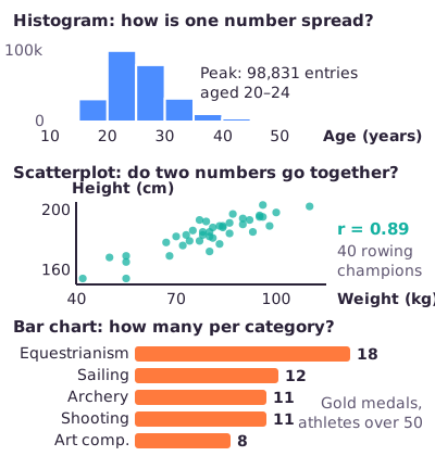
Figure: Histogram, scatterplot and bar chart, each drawn from the course's Olympics file (the bar chart shows the top five of the nine sports).
Chart
Use it for
Check
Histogram
Spread of one numerical variable
Bin width, shape, sample size
Bar chart
Count or value per category
Do bars show counts or averages?
Line graph
Values over time or another order
Gaps, units, comparable years
Boxplot
Compact summary, comparing groups
Q1, Q3, IQR, whisker rule, n
Violin plot
Distribution shape per group
Smoothing, sample size
Scatterplot
Two numerical variables together
Trend, clusters, extremes
Correlation plot
r for many pairs at once
Sign, strength, missing data
Histogram vs bar chart. Both use bars, but a histogram's x-axis is a number line cut into bins (ages 20–24, 25–29, …), so the bars touch and their order is fixed. A bar chart's x-axis is a set of categories (sailing, archery, …), which you may reorder freely.
Scatterplot with many points. When thousands of dots overlap, make them semi-transparent (lower the opacity, called alpha).
From the lecture: in the rowing champions' scatterplot, darker spots mean more athletes share that height-weight combination (92:10).
Analogy: charts are tools in a toolbox. A histogram is a ruler for one thing, a scatterplot is a pair of scales comparing two things, a bar chart is a tally sheet.
In short: one number's spread → histogram, boxplot or violin; two numbers → scatterplot; counts per category → bar chart; change over time → line graph.
14. Correlation, explained variance and spurious correlations
Plain definition. The correlation coefficient r runs from −1 to +1 and says how closely two numerical variables follow a straight-line pattern.
Positive r: both tend to rise together (taller athletes tend to be heavier).
Negative r: one tends to fall as the other rises.
r near 0: no straight-line pattern. There may still be a curved pattern.
Figure: r only measures straight-line patterns. The U-shape on the right is a strong relationship that r misses completely.
The lecture's correlation plot for the Olympics data (values match the course file):
Pair
r
Height – weight
0.80
Sex – weight
0.51
Sex – height
0.49
Age – weight
0.21
Sex – age
0.18
Age – height
0.14
All are positive (shown in blue on the plot). Height and weight are strongly related; age hardly relates to body size. In the R code below, sex is coded as a number, 1 = male and 0 = female, which reproduces the lecture's values; a positive r with height then means men tend to be taller.
data_olympics %>%
  mutate(Male = as.numeric(Sex == "M")) %>%
  select(Male, Age, Height, Weight) %>%
  cor(use = "pairwise.complete.obs") %>%     # use all rows where both values are known
  round(2)
#        Male  Age Height Weight
# Male   1.00 0.18   0.49   0.51
# Age    0.18 1.00   0.14   0.21
# Height 0.49 0.14   1.00   0.80
# Weight 0.51 0.21   0.80   1.00
From r to explained variance. r itself is not a percentage. The share of variation explained is its square:
In words: square the correlation to get the proportion of one variable's variation that a straight line through the other variable accounts for.
Worked example: height and weight in the Olympics data have r = 0.80. Then R² = 0.80 × 0.80 = 0.64. Height accounts for 64% of the variation in weight; the other 36% comes from other things (muscle, sport, sex and so on). This R² = r² rule holds for a simple straight-line regression with one predictor (one input variable) and an intercept (the line's starting value when the predictor is zero), as in Lecture 5; it does not carry over to every model.
Spurious correlations. Some correlations are strong but meaningless. The lecture's examples come from the "Spurious correlations" website by Tyler Vigen:
Per-person cheese consumption vs the number of people who died by becoming tangled in their bedsheets: r = 0.947 (the lecturer rounded it to 0.95).
The divorce rate in Maine vs per-person margarine consumption.
The number of people who drowned by falling into a pool vs the number of films Nicolas Cage appeared in: r = 0.666.
Why do they happen? Each chart has only about ten yearly data points, and with so few points two unrelated series can line up by chance, especially when someone searches through thousands of series for the best match. Correlation never proves causation: neither cheese nor Nicolas Cage causes deaths.
From the lecture: these correlations arise because there are very few data points; with larger datasets you would not find them so easily (93:15).
The lecture's point about percentages. The website labels the Nicolas Cage chart "Correlation: 66.6%". The lecture marks this as wrong ("THIS IS WRONG! Explained variance = R²"): a correlation is not a percentage of anything. The explained variance is r²:
Cheese and bedsheets: 0.947091² = 0.897, so 89.7%.
Nicolas Cage and pools: 0.666004² = 0.444, so 44.4%.
Exam note: If you open the slides PDF, page 53 shows the Nicolas Cage chart (r = 0.666) next to the text "0.947091² = 89.7%", which looks like a wrong pairing. It is not a lecture error. The slide was animated in two steps, first the cheese/bedsheet chart with its calculation and then the Nicolas Cage chart with "0.666004² = 44.4%", and the PDF printed both steps on top of each other, so the top layer shows the wrong combination. The correct pairs are r = 0.947 → 89.7% and r = 0.666 → 44.4%.
Analogy: ice-cream sales and drownings both rise in summer. They correlate, but ice cream does not cause drowning; hot weather drives both. (Illustration, not from the lecture.)
Exam angle. Expect to square an r (0.8 → 64%), to say that a high r does not prove causation, and to read a correlation plot (which pair is strongest, which sign). The 2024 practice exam showed a correlation matrix and asked which statements it supports; only claim what the numbers show, and never causation.
In short: r (−1 to +1) measures straight-line association only; explained variance is r² (0.8 → 64%), not r as a percentage; strong correlations can be pure coincidence, especially with few data points.
15. Building plots with ggplot2
Plain definition. ggplot2 builds a plot from layers, like transparent sheets stacked on top of each other. You start with the data and add one layer at a time with +. The lecturer called it one of R's unique selling points: you can change everything about a figure except the underlying data. There is a ggplot2 cheat sheet too.
Figure: The seven layers of a ggplot2 plot and the code that sets each one. Only the first three are needed for a basic plot.
Layer
What it does
Code example
Data
The data frame to plot
ggplot(data = mpg)
Aesthetics
Map variables to x, y, colour, size, shape, alpha (opacity), group
aes(x = displ, y = hwy)
Geometries
The marks: points, lines, bars
geom_point()
Facets
Subpanels, one per group
facet_wrap(~ class)
Statistics
Derived summaries, e.g. error bars, 95% confidence intervals
stat_summary()
Coordinates / scales
How values map to axes and colours: ranges, ticks, labels
scale_x_continuous()
Theme
Non-data look: background, font size, legend position (never the data)
theme_minimal()
Exercise 4a: a basic scatterplot. The mpg data has 234 cars. Put engine displacement (displ, in litres) on the x-axis and highway mileage (hwy, miles per gallon) on the y-axis.
library(ggplot2)
ggplot(data = mpg) +
  geom_point(mapping = aes(x = displ, y = hwy))
# draws 234 points: bigger engines (right) go fewer miles per gallon (lower)
geom_point() is what makes it a scatterplot. Swap it for geom_line(), geom_histogram() or geom_density() and you get a different plot type from the same start.
Exercise 4b: colour by class.
ggplot(data = mpg) +
  geom_point(mapping = aes(x = displ, y = hwy, color = class))
# 7 colours with a legend: 2seater, compact, midsize, minivan, pickup, subcompact, suv
Compact and subcompact cars cluster at the top left (small engines, high mileage); SUVs and pickups sit at the bottom right.
Exercise 4c: one panel per class instead of colours.
ggplot(data = mpg) +
  geom_point(mapping = aes(x = displ, y = hwy)) +
  facet_wrap(~ class, nrow = 2)
# 7 small panels in 2 rows, one per class
The ~ ("tilde") means "split by". nrow = 2 asks for two rows of panels. One extra line of code gives a completely different figure.
Scales: the lecture's example.
# a fragment: add these lines to a ggplot with +
scale_x_continuous(breaks = seq(0, 60, 10)) +
scale_y_continuous(breaks = seq(0, 30, 5), label = scales::dollar)
# run on their own they give: Error: Cannot add <ggproto> objects together.
seq(0, 60, 10) makes the numbers from 0 to 60 in steps of 10, which become the tick marks on the x-axis:
seq(0, 60, 10)
# [1]  0 10 20 30 40 50 60
label = scales::dollar writes the y-axis ticks as dollar amounts (0, 5, 10 … dollars, with a dollar sign in front).
Common confusion 1: colour inside or outside aes().
aes(colour = class)maps a variable: each class gets its own colour and a legend appears.
geom_point(colour = "blue")sets one fixed colour for all points.
geom_point(aes(colour = "blue")) is a classic mistake: R treats "blue" as a category label, draws every point in the first default colour (salmon red, #F8766D) and adds a legend entry called "blue".
Common confusion 2: + versus %>%. ggplot2 layers are joined with +. Using the dplyr pipe by mistake gives a real error:
ggplot(mpg, aes(displ, hwy)) %>% geom_point()
# Error in geom_point(.) : `mapping` must be created by `aes()`.
# ✖ You've supplied a <ggplot2::ggplot> object.
# ℹ Did you use `%>%` or `|>` instead of `+`?
Exam note: The lecture describes the coordinates layer through scale_ functions ("coordinates refer to how variables are mapped to the visual characteristics; scale functions modify this mapping"). In ggplot2 itself these are two related tools: scale_ functions control how values become axis ticks, labels and colours, while coord_ functions (such as coord_flip()) set the coordinate system. For the exam, link "coordinates/scales" to axis ranges, breaks and labels.
Exam angle. The 2022–2023 test exam asked which lifecycle step running ggplot() belongs to: data visualization. Also know which layer does what, and how to get one panel per group (facet_wrap).
In short: a ggplot = data + aesthetics (aes() mappings) + geom, plus optional facets, statistics, scales/coordinates and theme, joined with +; map colour inside aes(), set a fixed colour outside it.
16. Communicating results and dashboards
Plain definition. Visualization at the end of a project is about getting a message across to someone else: a coach, a reader, a medical team.
The lecture's tips for visualizing results.
Simplify. Remove everything that does not support the message.
Effective visuals. Choose the chart type for the question (Section 13).
Use colour deliberately, and remember colour-blind readers: do not rely on red versus green alone.
Self-explanatory visuals. A figure in your report must make sense without you standing next to it: clear title, labelled axes with units.
Large enough fonts.
From the lecture: colour blindness, self-explanatory figures and large fonts are "very simple things" but "very important because otherwise your message doesn't come across", also for the coach (95:23).
Dashboards and automatic reports. A dashboard is one screen that combines the most important numbers, filters and plots. The lecture lists three ingredients:
KPIs: the key performance indicators, the few numbers that matter most, go on top.
New insights from your own data: the dashboard is built around the user's own data.
Interactivity: filters and choices that let the user explore.
Figure:Illustration of a dashboard layout based on the lecturer's volleyball example: KPIs on top, filters at the side, detail below.
The lecture's volleyball dashboard. The lecturer demonstrated an interactive dashboard built in R Shiny for the national volleyball team. Every player wore a small sensor on the back (he compared it to a USB stick) that recorded how high they jumped.
The app loads the sensor CSV file and processes it into a data frame automatically.
Left: every individual jump, with its height.
Right: a density plot of each player's jumps. The plots differ by playing role; the lecturer contrasted the player who distributes the ball with the players at the net who smash.
Within one athlete: a week of jumps with trend lines and interquartile ranges over time; in one competitive week, one player jumped a bit less towards the end.
The embedded sport scientist can highlight patterns (for example jumps above a certain height), add comments and create a report for the coach.
His message: once you know your data and how to process it, building such reports is fairly easy, and that is the value of learning R. The topic returns in the guest lecture on volleyball.
Why it matters. A dashboard exists to support understanding and decisions, not to add interaction for its own sake.
In short: simple, self-explanatory, colour-blind-friendly figures with large fonts; dashboards put KPIs on top and add filters and interactivity so staff can explore their own data.
Common confusions
select() vs filter(): select chooses columns; filter chooses rows.
mutate() vs summarise(): mutate adds columns and keeps every row; summarise collapses each group into one row.
& vs | in filter():& needs both conditions true (2008 gold: 671 rows); | needs at least one (2008 or gold: 26,303 rows).
n() vs a mean with na.rm = TRUE: n() counts rows, including rows with NA; the mean uses only known values.
== NA vs is.na():x == NA always returns NA; use is.na(x).
Left vs inner join: left keeps every row of the first table (NA where unmatched); inner keeps only rows with a match in both.
Duplicate row vs repeated measurement: six identical-looking gymnast rows were six events; check enough columns.
Missing vs meaningless: Medal = NA means "no medal", which is information.
Outlier vs error: a boxplot dot is a value to check (the 97-year-old was real); the 28 kg footballer is an error.
Interval vs ratio: both have equal gaps; only ratio has a true zero, so only ratio allows "twice as much" and the CV.
Ordinal coded as numbers vs interval: medal codes 1–3 stay ordinal.
Validity vs accuracy: validity = follows the format, type and range rules; accuracy = matches reality. A value can be valid but inaccurate.
r vs R²: r = 0.8 is not "80% explained"; R² = 0.64 is 64% explained.
Correlation vs causation: a high r between cheese and bedsheet deaths proves nothing about cause.
Histogram vs bar chart: a histogram bins one numerical variable (bars touch, fixed order); a bar chart shows categories.
Boxplot vs violin plot: a violin also shows the shape of the distribution.
Colour inside vs outside aes(): inside maps a variable; outside sets one fixed colour.
+ vs %>%:+ adds ggplot2 layers; %>% passes data between dplyr steps.
Accessible vs open (FAIR): data can be restricted and still accessible if the access procedure is clear.
What the lecturer stressed
Data preparation takes 60–80% of a data scientist's time. (04:07)
Only ratio data allow a coefficient of variation: "definitely remember this one". (09:35)
Missing values can be information: Medal = NA means "no medal", so recode it. (73:57)
Boxplot dots are not automatically errors to remove; inspect them in context first. (88:42)
Spurious correlations arise easily with few data points; correlation does not imply causation. (93:15)
Good figures: colour-blind safe, large fonts, self-explanatory; put KPIs on top of a dashboard. (95:23)
Slide coverage map
Slides pp. 1–12: lifecycle, preparation, measurement scales, data quality and FAIR (Sections 1–4). Pp. 13–31: the Olympics data, dplyr verbs, exercises, pipes, summaries, joins, duplicates and missing values (Sections 5–10). Pp. 32–55: EDA and the Olympics plots, boxplot, violin, scatter, correlation plot, spurious correlations, missing-values plot, Exercise 3 (Sections 11–14). Pp. 56–73: visualization and dashboards, ggplot2 exercises 4a–4c and the seven layers (Sections 15–16). The recording adds the extreme-value stories, the volleyball dashboard and the "From the lecture" points woven into the sections. Canvas lecture page last checked 11 October 2026, 11:40 CEST.
Worked through the deep dive?Tick it off. Come back to any section whenever you need it.
3Step 3 of 35–8 min
Practice questions
3 exam-style questions. Exam-style open questions: short, with the points shown like on the real exam. Write your answer in the box, then check it against the model answer and the marking guide.
Question 1 — Measurement scales (2 points)
A physiotherapist records, for each patient, symptom severity ("none", "mild", "moderate" or "severe") and countermovement-jump (CMJ) height in cm. State and motivate briefly: 1) Name the measurement scale of each variable. 2) The severities are coded 0, 1, 2 and 3, and the mean code is 1.5. Is this mean meaningful?
Show answer and rationale
1) Symptom severity is ordinal: the categories have an order, but the gaps between them are unknown. CMJ height is ratio: equal gaps and a true zero (0 cm means no jump at all).
2) No. The codes are only ordered labels; nobody knows whether "mild to moderate" is the same step as "moderate to severe", so a mean of 1.5 has no clear meaning. Use the median (or counts per category) instead.
How the points are earned
0.5 pt Symptom severity is ordinal (order, unknown gaps)
0.5 pt CMJ height is ratio (true zero)
1 pt Mean not meaningful: codes are ordered labels with unknown gaps; use the median
How did your answer compare?
Question 2 — Reading a grouped summary (2 points)
The table athletes has three rows: sport A with age 20, sport A with a missing age (NA), and sport B with age 30. State and motivate briefly: 1) Give the output of the code below. 2) Explain why records and mean_age for sport A are based on different numbers of athletes.
1) A: records = 2, mean_age = 20. B: records = 1, mean_age = 30.
2) n() counts rows, including the row with the missing age. na.rm = TRUE makes mean() skip the NA, so A's mean uses only the one known age (20). A row count is not the same as the number of known values.
How the points are earned
1 pt Output: A records 2, mean_age 20; B records 1, mean_age 30
1 pt n() counts rows including the NA; na.rm = TRUE skips the NA in the mean
How did your answer compare?
Question 3 — Choosing a chart (2 points)
A volleyball coach has every jump height of the squad from one week, with each player's position (setter or hitter). State and motivate briefly: 1) Which chart shows how the squad's jump heights are spread? 2) Which chart compares jump heights between setters and hitters?
Show answer and rationale
1) A histogram: it shows the spread of one numerical variable by counting the jumps in each range (bin) of jump height. A boxplot or violin of all jumps is also fine.
2) A boxplot (or violin plot) per position, side by side: it compares the median, quartiles and extreme jumps of the two groups, and a violin also shows the shape of each distribution. A bar chart of two means would hide the spread.
How the points are earned
1 pt Histogram (or boxplot/violin), because it shows the spread of one numerical variable
1 pt Boxplot or violin plot per position, because it compares groups (median, quartiles; violin adds shape)