Lecture 6 covers supervised classification, which learns to predict a known category such as injured or not, and two unsupervised methods that find structure without known answers: k-means clustering and PCA. A youth-football injury study and a cyclist clustering study apply them.
The ideas to keep
Blur the explanations and test yourself.
Which model when. Known answers (labels) and a category target: a classifier such as a decision tree or random forest. A number target: regression. No labels: k-means to find groups, or PCA to summarise many variables in a few.
Under- and overfitting. An underfit model is too simple and does badly on training and new data (high bias). An overfit model learns noise: excellent on training data, poor on new data (high variance). Training error 1% with 11% on held-back data is overfitting; 15% with 16% is underfitting. The naive baseline, a model without predictors, is the extreme underfit every model must beat.
Testing on unseen data. Holdout splits once (say 70/30); k-fold cross-validation rotates k parts and averages; leave-one-out tests one case at a time. Good practice: lock away a test set, tune with k-fold inside the training data, test once at the end.
Trees and Gini. A decision tree asks the yes/no question whose child groups are purest. Gini impurity, 1 − Σp², is 0 for a pure group and 0.5 for a 50/50 mix; weighted by group size, the lowest wins.
Scoring a classifier. Precision is the share of flagged cases that are real; recall is the share of real cases that were flagged; F1 combines both. With a rare class accuracy misleads, so use F1 or balanced accuracy (the average hit rate of the two classes).
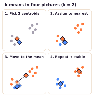
k-means. Choose k, drop k random centres, give each athlete to the nearest one, move each centre to its group's mean, repeat. Pick k where the within-cluster spread stops dropping fast (the elbow) or where the silhouette, how clearly points sit in their own cluster, peaks. Use z-scores (values in SD units) so no unit dominates. Good clusters are round, similar in size and separate.
PCA. New perpendicular axes: PC1 follows the largest spread, PC2 the most of what remains. Loadings are the original variables' weights; an axis's share of variance is its eigenvalue (the variance along it) divided by the sum of all eigenvalues.
The two studies. Rommers et al. predicted youth football injuries with about 85% precision, recall and F1 on training and test data alike, so no overfitting. Van der Zwaard clustered 24 cyclists by body build: sprinters formed one cluster, pursuit and road riders mixed over two.
What to be able to do
Map a problem to classification, regression, clustering or PCA.
Diagnose under- or overfitting from two error rates and name a fix.
Explain holdout, k-fold, leave-one-out and the caret code.
Calculate a weighted Gini, the six classifier metrics and explained variance.
Read confusionMatrix() output and elbow, silhouette and cluster plots.
Got the big picture?Mark the overview done to fill this lecture's ring.
2Step 2 of 312–18 min
Detailed notes
Lecture 6 covers supervised classification (predicting a known category), how to test and score a classifier, and two unsupervised methods, k-means clustering and PCA, each with a sport study.
In supervised learning every training example carries the right answer, its label: the model learns to predict the target (the outcome) from the features (the measured inputs, or predictors). In unsupervised learning there are no labels; the model only looks for structure in the features. So first ask: do I have labels, and is the target a category or a number?
Data and goal
Task
Method
Labels; category target (injured yes/no)
Supervised classification
Decision tree, random forest, XGBoost, KNN
Labels; number target (finish time in s)
Supervised regression
Linear regression (Lecture 5)
No labels; find groups of similar athletes
Unsupervised clustering
k-means
No labels; summarise many variables in a few
Unsupervised dimension reduction
PCA
The four classifiers solve the same problem:
A decision tree asks a chain of yes/no questions about the features (section 4).
A random forest trains many trees, each on a slightly different version of the data, and lets them vote.
XGBoost (eXtreme Gradient Boosting) builds trees one after another, each new tree correcting the errors of the trees before it (boosting).
KNN (k-nearest neighbours) gives a new athlete the majority label of the k most similar labelled athletes.
Classification and clustering both end with groups, but only classification has a known right answer for each athlete. Predicting injury yes/no from preseason tests (section 6) is classification. Grouping cyclists by body measurements without telling the algorithm their discipline (section 12) is clustering.
2. Underfitting, overfitting, bias and variance
A model must generalise: work on new data, not only on the data it learned from (its training data). A model that generalises well is neither underfit nor overfit.
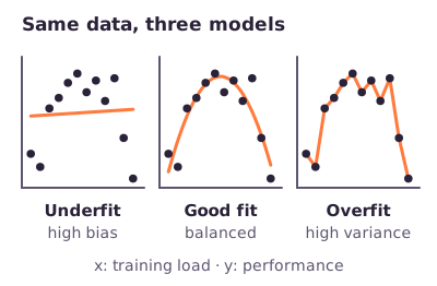
Underfitting (high bias): the model does not capture enough of the pattern. It performs poorly on both the training set and the test set.
Overfitting (high variance): the model captures noise, and patterns that do not hold in new data. It performs extremely well on the training set but poorly on the test set.
Figure: Underfit, good fit and overfit on the same data (Illustration, invented data).
Bias is the difference between the model's average prediction and the true value; a high-bias model oversimplifies, so it is easy to understand but too rigid to learn the real signal. Variance is how much the model would change if trained on different data; a high-variance model follows its training data too closely, noise included, and makes large errors on test data.
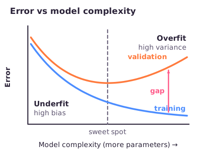
Complexity. As a model gets more complex (more parameters), bias falls and variance rises. Training error keeps falling. The validation error (the error on data kept apart from learning) first falls, then rises again once the model starts learning noise. The best model sits at the bottom of the validation curve.
Figure: The trade-off. Left of the sweet spot both errors are high; right of it the gap grows.
The naive baseline. The most extreme underfit is a model without predictors: it predicts the training-set average for every new case (for a category target, the most common class). It has maximal bias and does poorly on training and test data. You compare your model with this baseline to learn how much your predictors add; a useful model must beat it.
Worked example: the lecture's two exercises. Read bias from the training error and variance from the gap between validation and training error.
Training error 1%, validation error 11%. Bias is low (1%); variance is high (11 − 1 = 10 percentage points). Verdict: overfitting.
Training error 15%, validation error 16%. Bias is high (15%); variance is low (16 − 15 = 1 point). Verdict: underfitting.
Fixes.
Problem
Fixes
High bias (high training error)
Train longer; more complex model; more or better features; less regularization; new model architecture
High variance (low training, high validation error)
More data; fewer features; more regularization; new model architecture
Regularization is a built-in penalty that keeps a model simpler: less of it fixes high bias, more fixes high variance. A new model architecture means another model family, such as a neural network or a random forest.
3. Testing on unseen data: holdout and cross-validation
Cross-validation assesses how a model's results will generalise to an independent, unseen data set. It is a resampling procedure: with limited data, you reuse the same data in different train/test combinations.
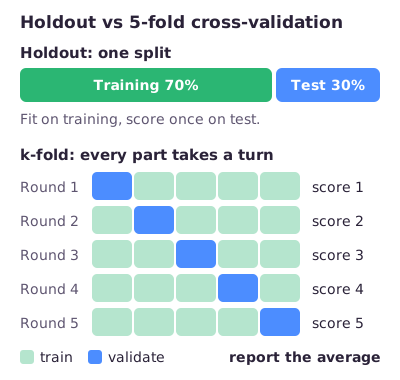
Holdout. Split the data once into a training set and a test set, for example 70/30. Build the model on the training set only, then predict the test set, whose answers the model has never seen. Base the split on the target (a stratified split), so every class appears in both sets: if almost all extensive sessions landed in the test set, the model could never learn that class.
k-fold cross-validation. Divide the data into k equal parts (folds). In each round one fold is the validation set and the other k − 1 folds are the training set, so every observation is validated exactly once and used for training k − 1 times. You average the k scores. k = 5 or 10 is usual (lower test error, reasonable computing time).
Leave-one-out cross-validation (LOOCV). k-fold with k = N, the number of observations: validate on one observation at a time. It is meant for very small data sets, such as 12 tests of one rower.
Figure: Holdout splits once; k-fold rotates the validation fold and averages.
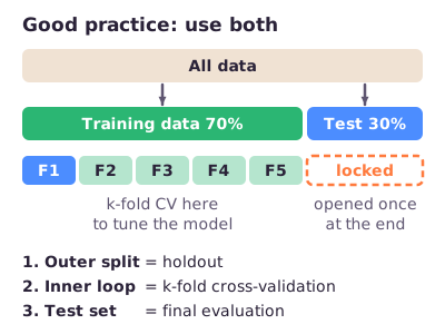
Good practice: combine them. The outer split is a holdout. Inside the training data, k-fold cross-validation tunes the model, for example its hyperparameters (settings chosen before training). So the validation set is used while building and tuning; the test set stays locked until one final evaluation.
Figure: Holdout outside, k-fold inside, test set used once.
Worked example: the lecture's Exercise 3. Split 70/30 and train a random forest that classifies sessions as interval or endurance training, with 10-fold cross-validation, using caret (an R package for splitting data, setting up cross-validation and training many model types).
train_id   <- createDataPartition(model_data$training_type, p = 0.7, list = F, times = 1)
train_data <- model_data[ train_id, ]   # 70%: training set
test_data  <- model_data[-train_id, ]   # other 30%: test set

fitControl <- trainControl(method = 'cv', number = 10, classProbs = T)

model <- train(training_type ~ ., data = train_data,
               method = 'rf', trControl = fitControl,
               verbose = F, metric = 'ROC')
createDataPartition(target, p = 0.7) picks 70% of the rows for training, balanced on the target.
trainControl(method = 'cv', number = 10) sets up 10-fold cross-validation. Because train() gets data = train_data, the folds are made only inside the training data and test_data stays untouched.
training_type ~ . means "predict training type from all other columns"; method = 'rf' picks a random forest, but any classifier could go there.
From the lecture: the lecturer expects you to know this code for the exam: the split, the 10-fold set-up and the train() call. The metric = 'ROC' part (a curve-based classifier score) is not needed.
4. Decision trees and Gini impurity
In a decision tree the first question is the root, later questions are internal nodes, and the end points, the leaves, give the prediction. A good question splits a group into child groups that are as pure as possible: mostly one class on each side. Purity is measured with the Gini impurity:
In words: for each class, square the share of the group in that class; add the squares; subtract from 1.
A pure group gives . A 50/50 mix of two classes gives , the worst case. A split is scored by weighting each child group by its size:
In words: each child's impurity counts in proportion to how many of the n cases it holds.
The tree computes this for every candidate question and picks the lowest. For a number feature such as age, the candidates are cut-offs: sort the rows by the feature, take the mean of each pair of neighbouring values, compute the weighted Gini for each cut-off and keep the lowest.
Worked example: the lecture's data. Can we predict whether someone likes sport from whether they like statistics, whether they code in R and Python, and their age?
Likes statistics
Codes R & Python
Age
Likes sport
Yes
Yes
25
No
No
Yes
43
Yes
No
No
12
Yes
Yes
Yes
17
Yes
No
No
28
Yes
Yes
Yes
35
No
Yes
Yes
37
No
Likes statistics? Of the 4 who do, 1 likes sport and 3 do not: Gini = . The 3 who do not all like sport: Gini = 0. Weighted: .
Codes R & Python? Of the 5 coders, 2 like sport and 3 do not: Gini = . The 2 non-coders both like sport: Gini = 0. Weighted: .
Age. Sorted ages 12, 17, 25, 28, 35, 37, 43 give cut-offs 14.5, 21, 26.5, 31.5, 36 and 40. The best is age < 21: the 2 younger people both like sport (Gini 0); of the 5 older, 2 like sport and 3 do not (Gini 0.48). Weighted: . The other cut-offs score 0.405 to 0.486.
Lowest of all is "Likes statistics?" (0.214), so it becomes the root. The tree then repeats the search inside each impure child group.
A single tree is easy to explain to a coach, but grown very deep it overfits: eventually every leaf holds one person. Random forests and XGBoost combine many trees to get more stable predictions.
5. Scoring a classifier: the confusion matrix and its metrics
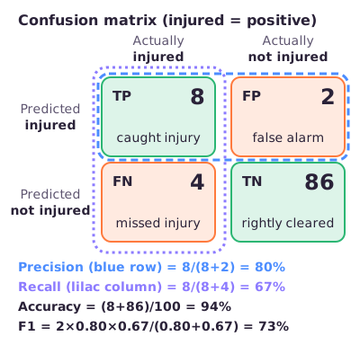
First choose the positive class, the class you are hunting for, such as injured. Every prediction then falls into one cell of the confusion matrix:
False positive (FP): predicted injured, really not injured (false alarm).
False negative (FN): predicted not injured, really injured (missed injury).
True negative (TN): predicted not injured, really not injured.
Figure: Precision reads along the "predicted injured" row; recall reads down the "actually injured" column (Illustration, 100 invented players).
In words: accuracy is the share of all predictions that were right. Precision (the positive predictive value) is the share of flagged athletes who really were positive. Recall (sensitivity, the true positive rate) is the share of real positives the model flagged.
In words: the harmonic mean of precision and recall, an average pulled towards the smaller of the two. F1 is 1 only with perfect precision and recall, and 0 if either is 0.
In words: specificity is the share of real negatives correctly cleared; balanced accuracy averages how well each class is recognised, so a rare class counts as much as a common one.
Worked example: (Illustration) a model screens 100 players, of whom 12 really get injured. It flags 10 players, and 8 of them really get injured. So TP = 8, FP = 10 − 8 = 2, FN = 12 − 8 = 4 and TN = 100 − 8 − 2 − 4 = 86.
Accuracy = (8 + 86) / 100 = 94%: 94 of the 100 predictions were right.
Precision = 8 / (8 + 2) = 80%: 8 of the 10 flagged players got injured.
Recall = 8 / (8 + 4) = 66.7%: 8 of the 12 injured players were caught; 4 were missed.
F1 = 2 × 0.80 × 0.667 / (0.80 + 0.667) = 72.7%.
Specificity = 86 / (86 + 2) = 97.7%: almost all healthy players were cleared.
Balanced accuracy = (66.7% + 97.7%) / 2 = 82.2%.
Accuracy (94%) flatters the model, because the 86 easy negatives dominate the count.
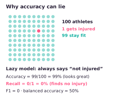
Imbalanced classes. When one class is rare, accuracy misleads. With 1 injury in 100 athletes, a model that always says "not injured" is 99% accurate yet finds nothing. Use accuracy when the classes are balanced; when they are imbalanced, use F1 or balanced accuracy.
Figure: The do-nothing model scores 99% accuracy but 50% balanced accuracy (Illustration).
Reading R's confusionMatrix(). Its output looks like this:
confusionMatrix(predicted, observed)
#           Reference
# Prediction No Yes
#        No  20   7
#        Yes  3  20
#
#                Accuracy : 0.8000
#                  95% CI : (0.6628, 0.8997)
#     No Information Rate : 0.5400
#     P-Value [Acc > NIR] : 0.0001186
#             Sensitivity : 0.8696
#             Specificity : 0.7407
#       Balanced Accuracy : 0.8052
#        'Positive' Class : No
Layout. Rows are the predictions, columns the true labels (Reference). Other layouts put the true labels in rows, so read the axis labels first.
Positive class. R takes the first level as positive, often "No" or "0". Here it is "No", so TP = 20 (real No predicted No), FN = 3, FP = 7 and TN = 20. Sensitivity (0.8696 = 20/23) is about the "No" cases; how well the real "Yes" cases are recognised is the specificity (0.74 = 20/27).
No Information Rate (NIR). The accuracy of always predicting the most common class, the naive baseline of section 2. Here "Yes" is most common: 27/50 = 0.54.
P-Value [Acc > NIR]. A test of whether accuracy beats the NIR. A small p-value alone does not make a model useful.
Verdict: fairly good, because accuracy (0.80) is well above the NIR (0.54), and balanced accuracy (0.81) shows both classes are recognised reasonably. If accuracy is high but balanced accuracy low (say 0.80 against 0.57), the model mostly predicts one class: rather poor.
6. Case study: predicting injuries in youth football (Rommers et al., 2020)
Can preseason test results predict which elite youth football players will get injured during the season? And can a similar model tell overuse injuries (from repeated strain) from acute ones (from one sudden event)?
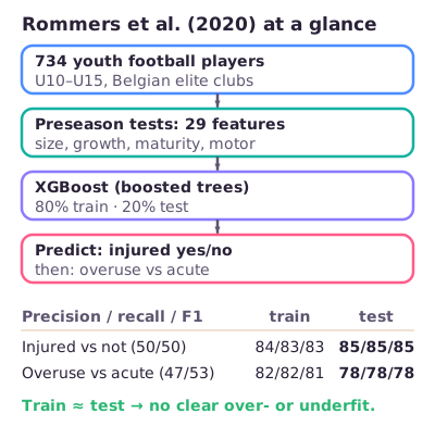
Figure: The study from data to results.
Data and method. 734 elite youth players did one preseason test battery (body size, growth and maturity, coordination, physical performance: 29 features) and were followed for one season. Two supervised classification models were built with XGBoost: injured vs not, and overuse vs acute among the injured. Each used 80% of the records for training and 20% for testing, scored with precision, recall and F1.
Results. Half the players got injured, so the classes were balanced. Test precision, recall and F1 were all 85%, training 84%, 83% and 83%. The injury-type model reached 78% on the test set.
From the lecture: with balanced classes the choice of metric hardly matters, and training and test scores are almost equal and fairly high: neither over- nor underfitting, a pretty good model.
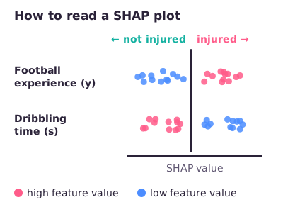
SHAP. A SHAP plot (SHapley Additive exPlanations) shows how much each feature pushed each player's prediction; the authors used it to extract the most important predictors. Read it like this:
Each dot is one player.
Features are ranked by importance; top rows have the largest overall impact on the model.
Horizontal position is the SHAP value: right of 0 pushes that player's prediction towards the positive class (injured), left towards not injured.
Colour is the feature's value for that player: red high, blue low, grey missing. Check the unit: for a sprint time in seconds, high means slow.
Figure: More football experience pushes towards injured (plausibly through exposure); longer dribbling time towards not injured (Illustration).
The top predictor was age at peak height velocity, the age at which a child grows fastest (a marker of maturity). SHAP shows what the model uses to predict, not what causes injury.
Conclusion. Preseason tests predicted injury with fairly high accuracy, and injury type slightly less well, which could make screening more efficient. Data science is a valuable addition to sports medicine but not the holy grail: one preseason measurement had to predict a whole season.
7. k-means clustering
k-means splits observations into k clusters so that points within a cluster are as similar as possible and points in different clusters as different as possible. Each cluster is represented by its centroid, the mean of the points assigned to it. "Similar" means close in Euclidean distance, the straight-line distance:
In words: Pythagoras, extended to as many features as you have.
k-means makes the clusters as compact as possible by minimising the total within-cluster sum of squares (WSS, tot.withinss in R):
In words: for every point, take its squared distance to its own cluster's centroid , and add these up over all K clusters. Smaller means tighter clusters.
The steps.
Choose the number of clusters, k (the analyst decides).
Start with k centroids at random positions, for example k randomly chosen data points.
Assign: give every point to its nearest centroid.
Update: move each centroid to the mean of the points now assigned to it.
Repeat steps 3 and 4 until the assignments stop changing or a maximum number of rounds is reached.
Figure: A bad random start is fixed within two rounds of assign and update (Illustration).
Because the start is random, two runs can end in different clusterings. So run the whole procedure from several random starts and keep the run with the lowest WSS. k-means favours compact, roughly round clusters, because it only uses the distance to a centre.
8. Choosing k: elbow, silhouette and NbClust
k-means needs you to choose k. Three tools help; none proves a single true k.
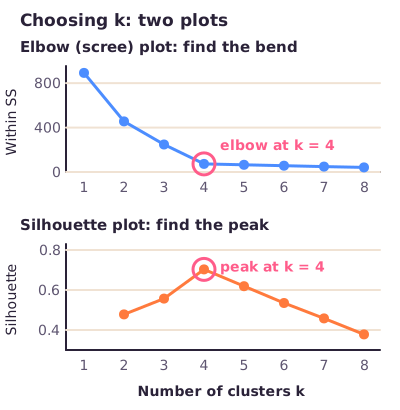
Elbow (scree) plot. Plot WSS against k. WSS always falls as k grows (with one cluster per athlete it is 0), so do not pick the lowest. Look for the elbow: the bend after which an extra cluster helps only a little. Reading the bend is subjective, so confirm it with another method.
Silhouette plot. For each point, the silhouette compares its distance to its own cluster with its distance to the nearest other cluster: near +1 it sits well inside its cluster, near 0 on the border, negative probably in the wrong cluster. Plot the average silhouette against k and look for the peak.
NbClust. An R package that computes many indices for the number of clusters and counts which k most of them favour.
Figure: Here the bend and the peak agree on k = 4 (Illustration, 100 invented points).
The methods can disagree, for example an elbow at 4 and a silhouette peak at 6. Then say what each suggests and decide with another check (NbClust, the cluster plot in section 11) and knowledge of the sport.
9. Preparing the input: representation and scaling
k-means only sees numbers and distances, so the way you represent the data changes the clusters. The lecture's example is points arranged in three rings around a centre. In x–y (Cartesian) coordinates, k-means cuts the rings into meaningless slices, because it looks for compact blobs. In polar coordinates (distance from the centre and angle), each ring has its own distance from the centre, and three clean clusters appear.
Units and scales matter too. Height in millimetres instead of centimetres has numbers 10 times bigger, so it dominates the distances and the clustering, although the athletes have not changed. The fix is to convert every variable to z-scores:
In words: subtract the column's mean and divide by its standard deviation ; z = 1 means one SD above average.
Every column then has mean 0 and SD 1, so all variables count equally. Subtracting the mean alone (centring) is not enough: it leaves the spreads different.
From the lecture: dividing by the maximum removes the units but not the differences in spread, so a widely spread variable still dominates; z-scores fix both, which is why the lecturer preferred them.
10. PCA: fewer axes that keep most of the spread
Principal component analysis builds new axes, the principal components, as weighted sums of the original variables. PC1 points in the direction in which the data spread out most. PC2 is perpendicular to PC1 and catches the most of the remaining spread; PC3 is perpendicular to both, and so on. PCA uses no target, so it is unsupervised. It is mainly used for dimension reduction: projecting the data onto a few components keeps most of the variation while losing little information. That lets you plot many-variable data in 2-D, helps find clusters, and shows which variables matter most for clustering. PCA itself predicts nothing and assigns no clusters.
How PC1 is found (the lecture's height–weight example):
Calculate the mean height and mean weight: the centre of the data.
Shift the data so this centre is the origin.
Fit the best line through the origin: the one with the smallest perpendicular distances to the points, which is also the line along which the projected points spread out most. That line is PC1.
Like Deming regression (Lecture 3), PC1 uses perpendicular distances, not the vertical distances of ordinary regression.
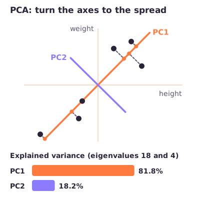
Figure: PC1 follows the main spread, PC2 is perpendicular; the bars use eigenvalues 18 and 4, as in the worked example below.
The vocabulary.
Loadings are the weights of the original variables in a component. In the height–weight example PC1 has slope 0.8: it is 1 part height and 0.8 parts weight, so height contributes more to PC1 than weight. The larger a variable's loading, the more it contributes. PC2 is −0.8 parts height and 1 part weight, so on PC2 weight matters more. With more variables, each component contains a fraction of all of them.
The eigenvector is the component's direction scaled to length 1; its parts are the loadings. For PC1, (1, 0.8) becomes (0.78, 0.62).
A score is an athlete's position along a component: its centred values times the loadings, added up.
The eigenvalue is the amount of variance along a component. PC1 always has the largest.
Explained variance is a component's eigenvalue divided by the sum of all eigenvalues.
Worked example: PC1 has eigenvalue 18 and PC2 has eigenvalue 4, so the total is 18 + 4 = 22. PC1 explains 18/22 = 81.8% of the variance and PC2 explains 4/22 = 18.2%; together 100%.
Reducing dimensions. Say you have 5 variables and PC1 and PC2 together explain more than 90% of the variability. You can then cluster directly on the PC scores, or keep only the original variables with the highest loadings. With PC1 loadings of 0.31, 0.08, 0.20, 0.24 and 0.17, that means variables 1 and 4. Either way, the remaining variance is thrown away. Because PCA works on spread, variables with big units dominate it too, so standardise first.
11. Judging a cluster result: the clustplot
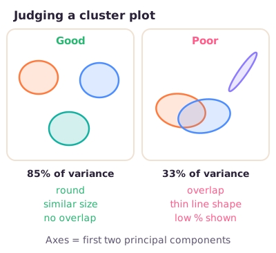
R's clustplot draws each cluster as an ellipse on PC1 and PC2 and prints how much of the variability those two components explain. Judge it on four points:
Overlap: as little as possible. If two clusters overlap almost completely, their members are not really different.
Shape: roughly round (spherical), not thin lines. A line-shaped cluster of a few points is driven by single athletes, and new athletes are hard to assign to it.
Size: clusters of similar size.
Variance shown: a high percentage. The rest lies in components the flat plot does not show, so with a low percentage the visible overlap or separation may mislead.
Figure: A good and a poor cluster plot (Illustration).
12. Case study: clustering cyclists by body build (van der Zwaard, 2019)
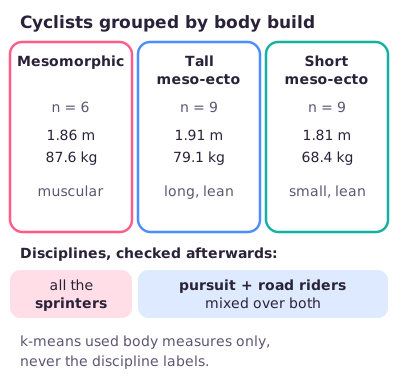
Do elite cyclists end up in the discipline that suits their body? The study clustered cyclists on anthropometry (body measurements) with k-means, then checked which disciplines fell in each cluster and how performance differed.
Data. 24 male cyclists at national to Olympic level, in track sprint, team pursuit and road. Nine body variables in three groups: body size (weight, height, body surface area), body composition (sum of skinfolds, body fat, muscle mass) and body shape, the somatotype: endomorphy (roundness, fat), mesomorphy (muscularity) and ectomorphy (long and lean).
Method. NbClust pointed to three clusters, and k-means was run with k = 3 on the nine variables. The disciplines were never given to the algorithm; they were compared with the clusters afterwards, so the analysis stayed unsupervised. The clustplot explained 85% of the variability and showed three non-overlapping, roughly round clusters of similar size.
Figure: The three clusters and where the disciplines ended up.
Results. If body build fully matched discipline, each cluster would hold one discipline. Instead, all sprinters formed the muscular, mesomorphic cluster, while pursuit and road cyclists were mixed over two lean, meso-ectomorphic clusters that differed in size (tall and short) rather than discipline. The mesomorphic cluster had higher sprint performance and the meso-ectomorphic clusters higher endurance performance, as their somatotypes predicted.
Meaning. Body build separates sprint from endurance cyclists but not pursuit from road cyclists, so the hypothesis was only partly confirmed. Clustering gives new insight into how athletes match their discipline to their body.
Exam traps
The supplementary slide's "Age < 31.5 = 0.1905" is only half the sum; the weighted Gini is 0.405, and the best root is "Likes statistics?" (0.214).
Lowest weighted Gini wins; numeric cut-offs are midpoints, not observed values.
The supplementary slides swap the word definitions of precision and recall; trust the formulas TP/(TP + FP) and TP/(TP + FN).
PC2 explains 4/(18 + 4) = 18.2%, not the slide's 17%; always divide by the sum of all eigenvalues.
"Total error = bias + variance" is the lecture's shortcut (strictly bias² + variance + noise); diagnose with training error (bias) and the gap (variance).
Overfitting is high variance (low training error, big gap); both errors high and close together is underfitting (high bias).
Cross-validation estimates generalisation to unseen data; it does not clean data or remove outliers.
If R's positive class is "No", sensitivity describes the "No" cases.
With imbalanced classes, compare accuracy with the no-information rate and judge with balanced accuracy or F1, not with the p-value.
Elbow = the bend, not the lowest WSS; silhouette = the peak.
Explained variance and the clustplot percentage are shares of spread, not accuracies.
Comparing clusters with known labels afterwards does not make clustering supervised; PCA is unsupervised too.
To weigh variables equally, use z-scores, not centring, dummy variables or binning.
A top SHAP feature predicts injury; it is not shown to cause it.
Try the interactive explanation
Open the interactive page to change TP, FP, FN and TN and watch the metrics move, step through k-means, and switch on the PCA axes.
Worked through the deep dive?Tick it off. Come back to any section whenever you need it.
3Step 3 of 35–8 min
Practice questions
3 exam-style questions. Exam-style open questions: short, with the points shown like on the real exam. Write your answer in the box, then check it against the model answer and the marking guide.
Question 1 — Choosing a metric for a rare outcome (3 points)
A screening model predicts which of 100 young players will get injured this season (injured = positive); only 10 players really got injured. On the test set it gives TP = 6, FP = 4, FN = 4 and TN = 86, so its accuracy is 92%. State and motivate briefly: 1) the recall, and what it means for the coach; 2) why accuracy is a poor way to judge this model, and which metric you would use instead.
Show answer and rationale
1) Recall = TP/(TP + FN) = 6/(6 + 4) = 60%: the model catches 6 of the 10 players who really got injured and misses 4.
2) Injury is rare (10%), so the classes are imbalanced: a model that predicts 'not injured' for everyone already scores 90% accuracy while finding no injury at all, so 92% says little. Use the F1 score (harmonic mean of precision and recall, here 0.60) or balanced accuracy (average of recall and specificity), which give the rare injured class proper weight.
How the points are earned
1 pt Recall = 6/10 = 60%: the share of truly injured players the model flagged (4 missed)
Question 2 — Choosing the number of clusters (2 points)
You cluster 50 rowers on body measurements with k-means, without giving the algorithm their discipline. The elbow plot bends at k = 3, but the average silhouette is highest at k = 2. State and motivate briefly: 1) whether this is supervised or unsupervised learning; 2) how you would decide on k.
Show answer and rationale
1) Unsupervised: no labels (disciplines) are used to form the groups; the algorithm finds groups in the measurements alone. Comparing the clusters with the disciplines afterwards does not change that.
2) The elbow (bend in the falling within-cluster sum of squares) suggests 3; the silhouette (peak of the average score; higher = points sit more clearly in their own cluster) suggests 2. Neither proves the true k, so compare k = 2 and 3 with another check such as NbClust or the cluster plot (overlap, shape, size) and knowledge of rowing, and choose the more meaningful solution.
How the points are earned
1 pt Unsupervised, because no labels are used to form the clusters
1 pt Elbow → 3 (bend), silhouette → 2 (peak); they disagree, so add another check (NbClust, cluster plot, domain knowledge)
How did your answer compare?
Question 3 — Judging a cluster plot (2 points)
The k-means result for the rowers is shown in a cluster plot on the first two principal components, which 'explain 72% of the point variability'. Two of the three clusters overlap heavily. State and motivate briefly: 1) what the 72% means; 2) whether this is a good clustering.
Show answer and rationale
1) PC1 and PC2 together hold 72% of the variation in the data; the other 28% lies in components the flat plot does not show. It is not an accuracy.
2) Poor: two clusters overlap heavily, so rowers in those clusters are not really different. A good clustering shows little overlap, roughly round clusters of similar size and a high % of variance; with 72% shown the overlap is fairly trustworthy, though some separation could lie in the hidden 28%.
How the points are earned
1 pt 72% = share of the total variance shown by the two plotted components (the rest is hidden; not an accuracy)
1 pt Poor clustering because of the overlap (good: little overlap, round, similar size)